Created by the Kawaii Vibe editorial team. Our named style desks are editorial personas. Product details and availability can change.
Short answer: build around the fox's orange, not against it. Pick one neutral base (cream is easiest), add one deeper warm tone like caramel, and bring in one soft green to calm everything down. Keep the orange to one main spot, usually the hoodie itself, and the outfit will look planned instead of loud.
Orange is the colour people worry about most, and it's fair. It can fight with pink, with bright red and with cool greys. It can also make some skin tones look tired if it sits right at the face. The good news is that a few small choices fix nearly all of it.
This guide walks through palettes, proportions, accessories, weather, and a checklist you can use before you buy. We're a retailer, so we point to a few pieces from the shop as optional ideas, but the colour logic works with anything already in your wardrobe.
The quick formula: one orange, one neutral, one calm accent
If you only remember one rule, make it this: three colour jobs. The fox hoodie is your orange. Cream, oat or off-white is your neutral. Soft green, sage or olive is your calm accent. Caramel can step in as a bridge between the orange and the cream, but it counts as part of the warm family, not a fourth colour.
Why does it work? Orange sits between red and yellow, so it looks best next to colours that share that warmth or sit opposite it in a muted way. Green is close to the opposite side of the wheel from red-orange, but when it's soft and greyed it doesn't shout. It reads as leaves next to a fox, which is basically the story the motif is already telling.
Try it as a test at home. Lay the hoodie on a bed, put your bottoms and shoes beside it, and squint. If one thing jumps out harder than the hoodie, swap it. The hoodie should be the loudest thing, and everything else should quietly agree with it.
Reading the orange on your fox hoodie
Not every fox hoodie is the same orange. Some lean yellow, like marigold or apricot. Some lean red, like rust or paprika. Some are washed out and peachy. Before you pick a palette, look at the print in daylight and decide which direction it leans, because that decides which neutrals sit nicely beside it.
Yellow-leaning orange loves cream, butter and olive. Red-leaning orange loves warm browns, deep green and ivory. Peachy orange loves soft white, light tan and pale sage. If you put a yellow-leaning orange next to a cold, blue-white, it can look slightly dirty, so lean towards creams with a hint of warmth.
Also check how much orange there actually is. A hoodie with a small fox patch and a cream body is a very different job from a fully orange body. Small patches let you wear almost any neutral. Big blocks need more care, and they need more quiet around them.
Cream as your base: outfits that start here
Cream is the friendliest partner for orange because it softens it without fighting it. Try a cream or oat hoodie with a small fox print, then add caramel trousers or a tan skirt. The result is almost all one warm family, and the fox becomes the cute detail instead of the whole show.
For an orange-heavy hoodie, flip it. Wear cream wide-leg trousers or a long cream skirt below and keep the top as the only strong colour. Add white or cream socks and simple trainers. The cream gives the orange room to breathe, so it feels cosy rather than busy.
Watch the cream shade. Stark optical white next to warm orange can make the cream look yellow and the orange look harsh. If your cream pieces look grubby next to the hoodie, move one step warmer, towards ivory or oat. Browse the main hoodies collection if you want a plain cream or neutral layer to sit under or beside a fox print.
Caramel and tan: the bridge colours
Caramel works because it's orange that has calmed down. Mix it in as trousers, a tote, a belt, a knit beanie or boots. It sits between the loud hoodie and the quiet cream, so your eye travels smoothly down the outfit instead of stopping dead at the hoodie hem.
A good formula is hoodie, caramel bottoms, cream shoes. Another is cream bottoms with caramel shoes and a caramel bag, so the warm shade appears at both ends. Repeating a colour in two places makes an outfit feel deliberate, which is a big part of looking put together.
Avoid caramel that's almost the same as the hoodie orange but a bit off. Near-matches look like a mistake. Either match closely or go clearly darker, like a chocolate or toffee brown. If the two shades are within a hair of each other, change one.
Soft green: the colour that stops the clash
Green is the secret helper. A sage cardigan, olive cargo trousers or a moss green bucket hat gives the eye somewhere cool to rest. It also makes the orange look richer, since the two colours are far apart on the wheel but both feel earthy and natural.
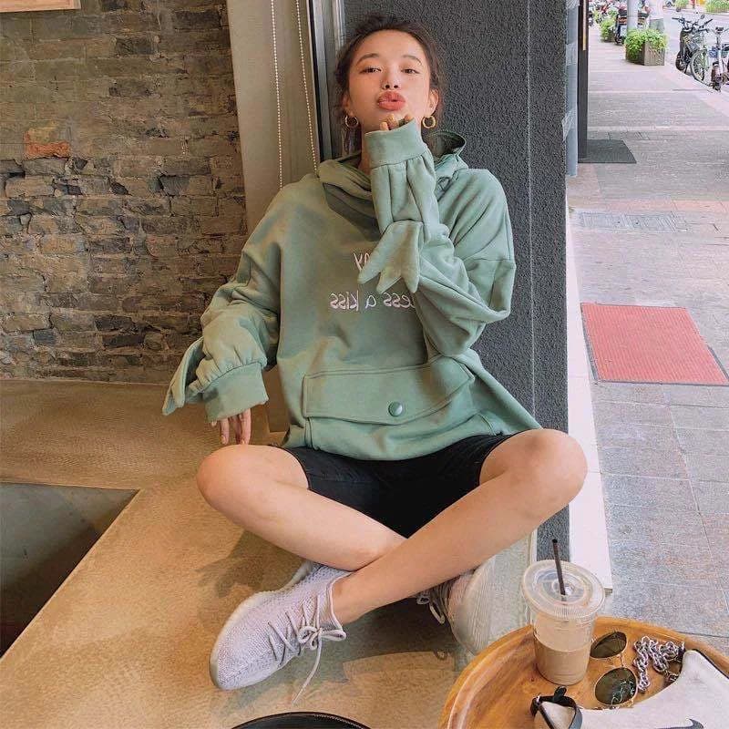
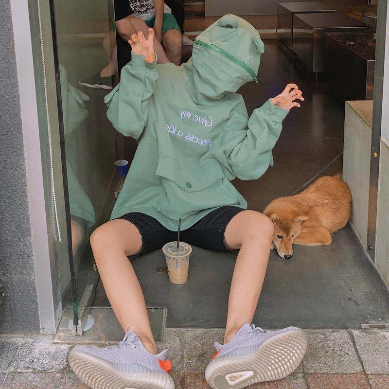
Placement matters. Green on the bottom half, like trousers or a skirt, anchors the outfit. Green on the top as an overshirt or jacket over the hoodie reveals only a strip of orange, which feels more subtle. If you want to see how other animal prints handle green, the Kawaii Frog Hoodie is a useful reference point for how a green animal piece sits with neutrals, and it comes in S to XL as pictured.
Keep the green muted. Sage, khaki, olive and pine all work. Bright mint, lime or emerald next to orange can feel like a sports team. Go for greens that look like they have a touch of grey or brown in them.

What clashes with orange and how to fix it
The usual trouble makers are hot pink, bright red, cool grey and royal blue. Hot pink and orange can work in a deliberate, high-energy outfit, but by accident they look like a mix-up. Bright red turns the fox into a warning sign. Cool grey can make orange feel flat and slightly harsh.
The fix is rarely to remove the colour completely. Reduce it. Swap hot pink for a dusty rose in socks only. Swap bright red for a deep wine or brown. Swap cool grey for warm greige or stone. Often the shade is the problem, not the colour family.
Also watch for patterns. Stripes, checks and florals in competing colours add more orange-clashing risk. If the hoodie has a lot going on, keep the rest in solid, quiet tones. One busy item per outfit is plenty.
Proportions and layering around the face
Orange near your face is where flattering or not gets decided. If a bright orange makes you look tired, don't ditch the hoodie. Put a cream or oat layer closer to your face, like a collared shirt, a turtleneck under it, or a scarf, so the strongest colour is a step away from your skin.
For shape, a boxy or oversized hoodie looks best with slimmer or straight bottoms, so you don't vanish into fabric. A cropped or fitted hoodie can take wide-leg trousers. Tuck a corner of the hoodie hem if you want a waist, or leave it loose for a relaxed look.
Hood up or down changes the colour balance too. A hood down creates a large orange ring around the neck, so add a necklace or a light scarf to break it up. A hood up with a beanie underneath is good for cold days and keeps the colour more contained.
Five outfits to copy and adapt
Outfit one: oat fox hoodie, caramel straight trousers, cream trainers, olive tote. Calm and everyday. Outfit two: orange fox hoodie, cream wide-leg trousers, sage socks, tan shoes. Cosy and clear. Outfit three: cream fox hoodie, olive cargo skirt, brown boots, chocolate beanie. Slightly more grown up.
Outfit four: fox hoodie under a sage denim-style jacket, cream jeans, white trainers. Great when you want just a flash of orange. Outfit five: fox hoodie, ivory pleated skirt, warm brown tights, ankle boots, small caramel bag. Sweet without being childish.
To adapt any of them, change only one piece at a time. Swap the trousers for a skirt, the boots for trainers, or the bag for a backpack. If it still fits the one orange, one neutral, one calm accent idea, it will work. For more seasonal layeringWearing pieces over or under one another to add depth, warmth or contrast. ideas, look at the fall clothes edit.
Accessories that tie the palette together
Accessories are the cheapest way to fix a palette. A cream beanie, a caramel tote, sage socks or a brown belt can pull the hoodie into the rest of the outfit. Start by picking one accessory in each supporting colour and see which one the outfit needs. Our accessories collection is a good place to look for small pieces like these.
Metal tones matter more than you'd think. Gold and brass look warm next to orange and caramel. Silver and cool chrome can feel slightly sharp. If you wear jewellery, lean gold, or go for simple wooden or cord pieces for a woodland feel.
Bags and shoes should do repeat duty. If your bag is caramel, let your shoes be cream or deep brown, not another orange. Too many accessories in the same shade turns warm into heavy. Two echoes of a colour are enough.
Other animal hoodies that share the palette
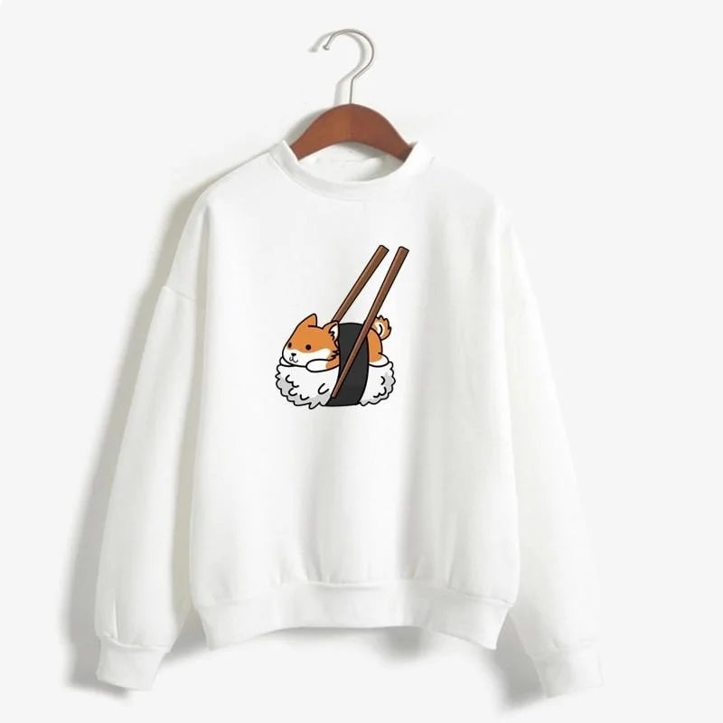
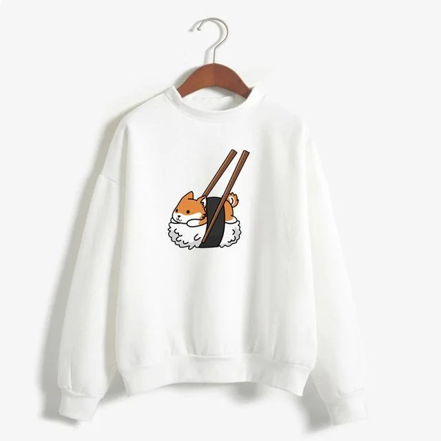
If you like the warm look but want variety, other animal pieces slot into the same colour logic. The Kawaii Shiba Inu Sweatshirt is listed in Brown, Yellow, Light Yellow and Dark Green among other colours, and sizes M to XXL. Brown or yellow options sit naturally in a caramel and cream wardrobe, and Dark Green gives you the calm accent in a single piece.
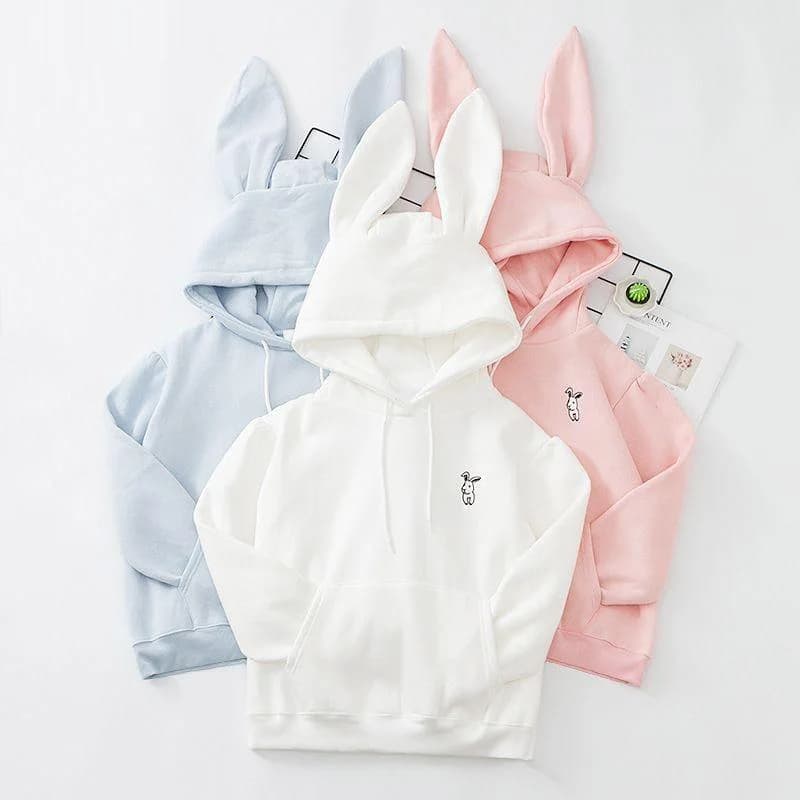
The Kawaii Bunny Hoodie comes in Blue, Black, Pink, White and Purple, sizes S to XXL. White is the one that fits a cream and caramel palette easily, since you can add a fox-coloured scarf or tote to bring in the warmth. Black works too, as a neutral to ground orange accessories.
Mixing two animal prints in one outfit is a lot. Pick one as the hero and keep the other as a quiet, plain piece. Use the wider kawaii hoodies collection to compare cuts and colours side by side before you decide.

Weather and season notes
Warm palettes aren't tied to one time of year. In cooler weather, add layers in your palette: a cream knit under the hoodie, a sage coat over it, a caramel scarf. In milder weather, drop the coat and let the hoodie sit over a plain tee, with lighter cream trousers or a skirt.
In hot weather, a thick hoodie may be too much, so use the palette in lighter pieces instead: a caramel tote, a cream cap, sage socks, and carry the hoodie for cold indoor spaces. Colour works even when the layer doesn't. For rain, a deep olive or tan raincoat over the top keeps you in the same family.
Check the fabric details on each product page before you rely on a hoodie for a specific climate. Where a material isn't listed, we don't make claims about warmth, so compare weight and fit in the photos and sizing information instead.
How to compare options before you buy
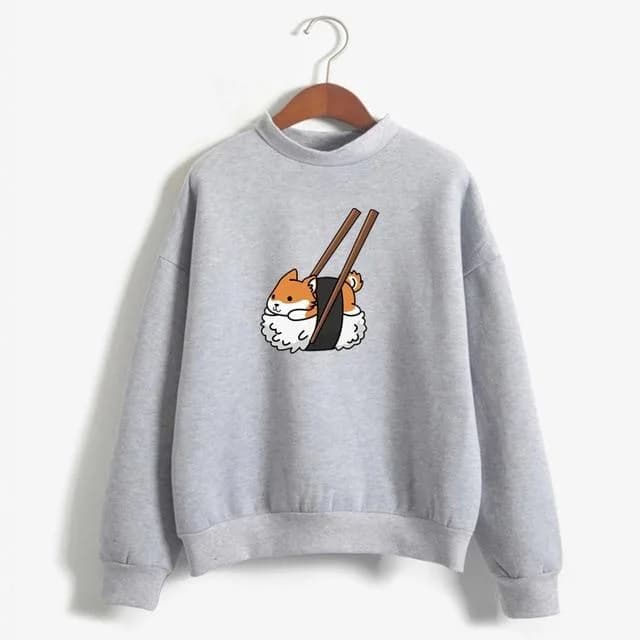
Start with colour: does the orange lean yellow, red or peach, and do you already own neutrals that suit it? Then look at the print size. A big fox is the hero; a small one is more flexible. Then check cut: oversized, standard or zip-up, because that affects how you layer.
Next, look at sizes and colour options on the page. Some items come in a long range, others only in a few sizes. For example, the Oversized Stawberry Kawaii Hoodie comes in Pink and White, sizes M to XXL, which shows what an oversized cut can look like if you prefer styling a roomy piece with neutral separates instead of doubling up on heavy layers.
If you like the zip-up idea for easy layeringWearing pieces over or under one another to add depth, warmth or contrast., the Kawaii Dinosaurs Zipper Hoodie is listed as pictured in S to L. A zip piece can sit open over a plain cream top, which is the same layeringWearing pieces over or under one another to add depth, warmth or contrast. trick you would use with a fox hoodie. Always read each product page for specifics we haven't stated here.

Common mistakes and a quick fix for each
Mistake one: matching everything. Head-to-toe orange looks flat. Break it with cream or green. Mistake two: too many bright accents. If the hoodie is already loud, keep the rest quiet. Mistake three: cold white next to warm orange. Move to ivory.
Mistake four: ignoring shoes. White trainers are fine, but chunky black ones can drag a soft palette into something heavier. Try tan, brown, cream or sage instead. Mistake five: forgetting the hood. If it sits in a heap around your neck, add a necklace or fold it neatly.
Mistake six is buying a colour you have no partners for. Before you add a hoodie to your basket, name three things you already own that go with it. If you can't, either choose a more neutral version or plan a small shopping list for cream, caramel or sage basics.
Your pre-buy and pre-wear checklist
Use this list when you're deciding on a fox hoodie, or when you're standing in front of the mirror and something feels off. It covers colour, shape and finishing touches in the order they matter most, so you can fix the biggest issue first.
If you can tick most of these, the outfit will almost certainly work. If not, change just one item and check again rather than starting over. Small swaps are usually all it takes to turn an odd outfit into a good one.
- Is the orange yellow, red or peach leaning, and have I picked neutrals to match?
- Is there only one strong orange area in the outfit?
- Do I have a cream or oat piece near the hoodie?
- Is there a caramel or brown bridge colour somewhere?
- Is my green soft, muted and earthy, not bright?
- Have I repeated a colour in at least two places?
- Are my metals warm, like gold or brass?
- Does the shape balance, loose on top and slimmer below or the reverse?
- Have I checked sizes and colour options on the product page?