Created by the Kawaii Vibe editorial team. Our named style desks are editorial personas. Product details and availability can change.
Building an indie aesthetic outfit usually falls apart when every single piece competes for attention. When chunky chains, loud prints, novelty buckles, stacked rings, and patterned bags collide simultaneously, the overall silhouetteThe overall shape an outfit creates, from fitted to loose and layered. loses its impact. The solution is straightforward: select one defined anchor piece from your collection and treat everything else as supporting structure.
Deciding where you want the eye to land first changes how you shop and how you get dressed. Whether that primary accent is an eye-catching waist accent, a cluster of charms near your face, or a graphic tech accessory held in your hand, giving that item breathing room creates intention. This guide walks through the exact mechanics of establishing visual hierarchy with indie accessories, keeping your everyday wardrobe cohesive rather than chaotic.
We will dissect proportion, texture, and color placement across key accessory categories. By mapping out where accents sit against basic layers, you can build balanced looks suited for any climate without feeling overwhelmed by conflicting details.
The Rule of the Single Anchor in Indie Styling
Indie styling naturally invites playful experimentation, but too many statement items worn together dilute the character of each piece. When you treat every accessory as an equal priority, viewers do not know where to look. Establishing a single focal point provides an immediate visual anchor. Once that anchor is locked in, every secondary piece simply reinforces the mood without fighting for dominance.
Consider the vertical space of your body as three distinct zones: the upper third around the face and collar, the middle third along the waist and hips, and the lower third down to the shoes. If your main accent lives in the middle third, your upper and lower choices should pull back in scale. This approach lets high-character pieces stand out sharply against cleaner backdrops instead of blending into visual noise.
To test your outfit balance before stepping out, take a step back from a full-length mirror and blur your eyes slightly. If your gaze jumps erratically between three different spots, remove one competing item. Giving one strong accent clear visual real estate is the most reliable way to make eclectic styling feel considered and wearable.
- Upper zone anchors: layered necklaces, statement earrings, bucket hats, or bold beanies.
- Middle zone anchors: novelty grommet belts, chain loops, or vibrant crossbody satchels.
- Lower zone anchors: platform boots, patterned knee socks, or leg warmers with subtle hardware.
Centerpieces at the Waist: Styling Around Statement Belts
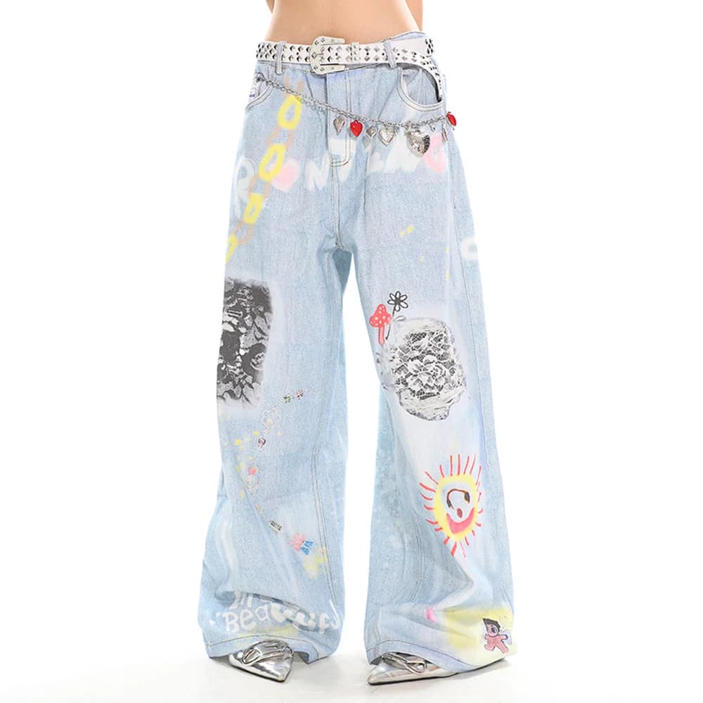
A statement belt anchors an outfit directly at your center of gravity. When you choose an eye-catching waist accent—such as a piece with heavy metallic hardware, double-prong buckles, or distinct grommets from our indie belts range—your top and bottom choices need cut-outs, tucks, or neutral surfaces that showcase that waistline clearly.
A strong waist piece looks best when balanced with clean denim or solid skirts. For example, pairing a structured belt with relaxed bottoms like the Indie Kid Baggy Jeans in Blue denim gives the belt a grounded, relaxed canvas. Because these jeans provide a wide-leg cut with subtle roominess, a solid belt creates definition right where the proportions widen out, keeping the silhouetteThe overall shape an outfit creates, from fitted to loose and layered. sharp and intentional.
When your belt is the declared centerpiece, avoid oversized tops left untucked, as they hide the focal point entirely. Instead, use a French tuck or cropped fit. Keep upper jewelry minimal—perhaps a thin wire chain or tiny studs—so the eye remains drawn toward the waistline.
- Tuck lightweight tees fully into high-rise or mid-rise waistbands to expose hardware.
- Balance wide-leg denim cuts with defined waistbands to avoid losing your natural frame.
- Keep bag straps short or hand-carried so they do not slice horizontally across the belt.

Ear and Neck Focus: Balancing Jewelry with Clean Tops
When your focal point sits near your face, jewelry takes the lead. Curating statement pieces from the indie jewelry section—like stacked beaded chokers, chunky silver padlock chains, or oversized wire earrings—requires careful coordination with your neckline. If your top has elaborate ruffles, contrasting collars, or busy chest graphics, your jewelry will visually blur against the fabric.
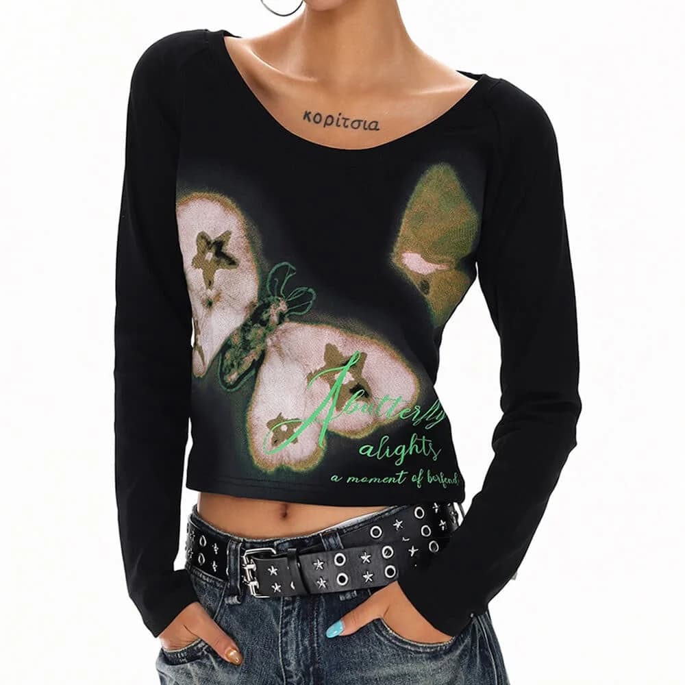
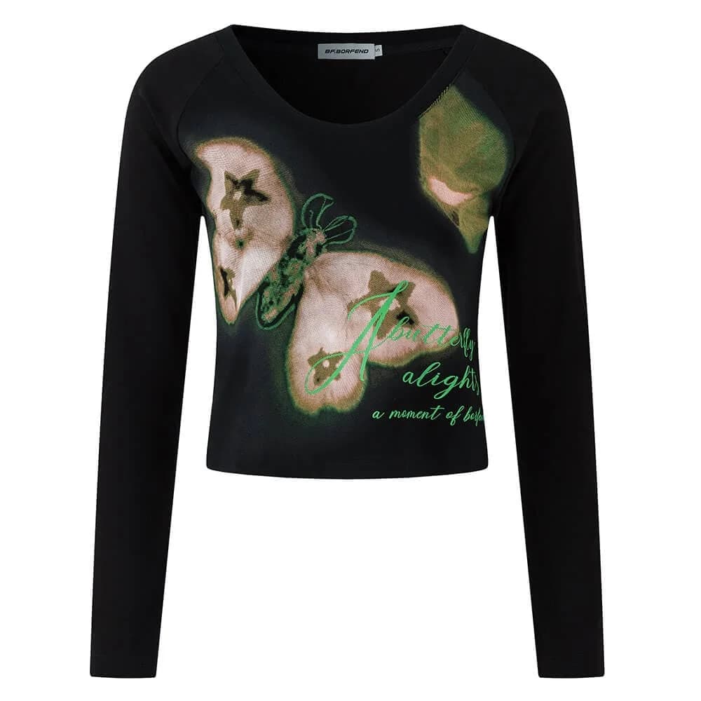
An open neckline, simple crew neck, or monochrome base allows metal finishes and colorful beads to pop. If you want a casual, low-fuss outfit where your necklace stack remains central, layer a neutral piece like the Indie Butterfly Print Long Sleeve Top in Black or White cotton-polyester. The straightforward neckline provides clean placement for chains, while the printed sleeve details frame the torso without crowding the chest area.
If you opt for massive statement earrings instead of necklaces, keep your neck completely bare. Pairing shoulder-grazing earrings with heavy chokers crowds the jawline and visually shortens the neck. Pick either ears or neck to lead, leaving the adjacent area bare or subtly supported by simple, low-profile pieces.

Everyday Tech Accents: Making Phone Cases the Daily Hero
In modern street and casual style, your phone functions as a constant visual accent. Because it is frequently held in hand or visible in back pockets, pulling a distinct design from our indie phone cases selection can serve as your primary pop of color or quirky pattern, especially if you prefer wearing minimalist or thrifted neutral apparel.
When your phone case features intense graphics, vivid neon tones, or novelty dimensional charms, treating it as an accessory changes how you select outer layers. If your case is covered in high-energy motifs, wearing heavily conflicting patterns across your sleeves and bags can make daily movement feel visually cluttered. Instead, let the case be the single playful interruption against a monochrome sweater or simple canvas tote.
This approach works especially well for students and commuters who want an indie flair during work or study hours without violating practical dress codes. Your device provides that intentional burst of personality whenever you take a mirror photo, hold your phone on transit, or leave it sitting on a café table.
- Pair graphic tech covers with muted monochrome jackets to make the artwork pop.
- Avoid matching phone cases to busy patterned bags to reduce optical competition.
- Choose matte or gloss case finishes that complement the textures of your everyday outerwear.
Pattern Clashing vs. Pattern Framing: Choosing Your Top Layer
A common stumbling block in indie styling is the difference between deliberate pattern framing and chaotic pattern clashing. When you wear a distinct accessory, your clothing should frame it rather than compete with it. A garment from our wider indie clothes collection can either act as a neutral frame or supply a controlled background that harmonizes with your chosen accessory.
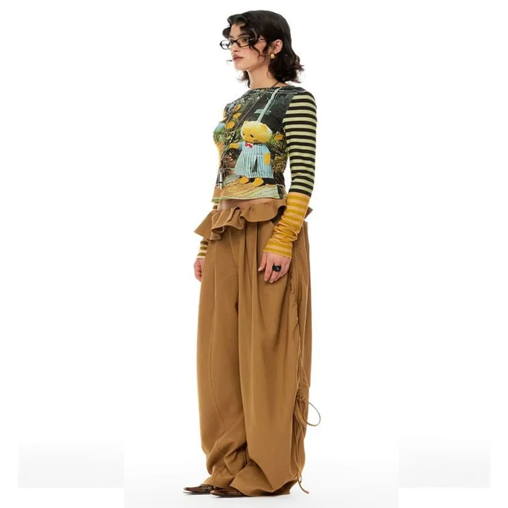
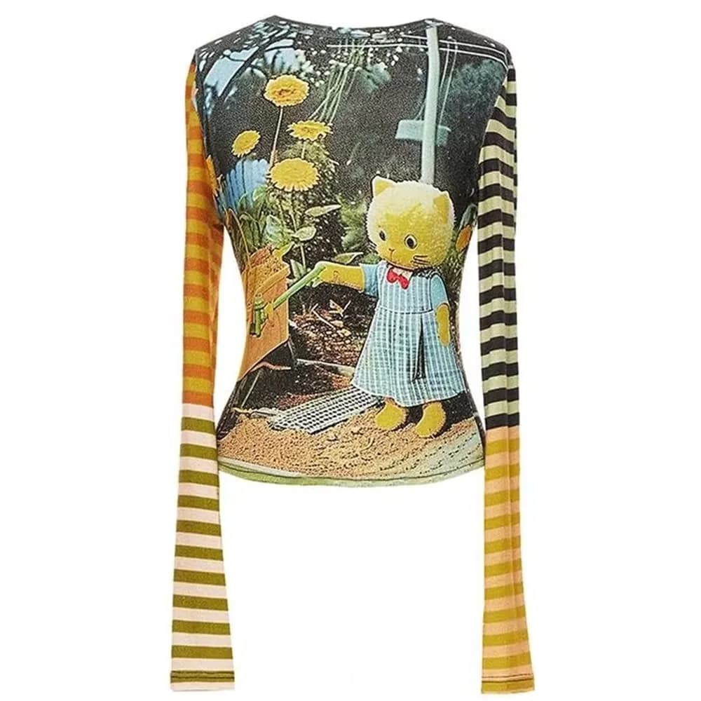
For instance, if your focal accessory is a textured, single-color bag or plain silver choker, you have room to bring pattern into the clothing itself. The Indie Liminal Cat Striped Long Sleeve Top, constructed from lightweight Yellow polyester, offers strong visual horizontal lines. If this striped piece is your base, accessories should remain plain: think smooth black faux-leather bands, minimal rings, or unadorned crossbodies that rest quietly against the yellow stripes.
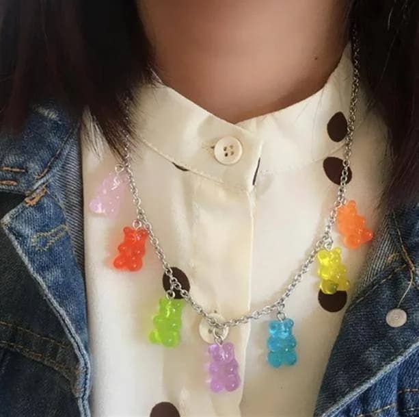
Conversely, if you are wearing a multi-charm necklace with bright resin pendants, swap patterned shirts for solid-color garments. Let the fabric provide a calm background so the detailed charm shapes remain legible from a normal speaking distance.
- Pattern framing: Solid shirts backing multi-colored, intricate necklaces or brooches.
- Controlled clashing: Subtle micro-stripes paired with a single solid statement accessory.
- Avoid: Wearing large-scale pictorial graphic tops directly under novelty picture-frame pendants.
Proportion Play: Highlighting the Lower Body and Shoes
Accessories do not stop at your waist; legwear, socks, and shoe attachments can anchor an entire silhouetteThe overall shape an outfit creates, from fitted to loose and layered.. When your focal point sits around your shins or feet—such as chunky platform boots paired with layered leg warmers—the lower half of your outfit must carry the visual weight cleanly without being swallowed by excessive bulk from above.
To let your leg accessories and footwear take center stage, pair them with shorter hemlines that leave plenty of negative spaceAn uncluttered area that gives the rest of a design room to stand out.. The Indie Kid Puffer Mini Skirt in Green, Brown, Beige, or Grey polyester offers a neat, structured silhouetteThe overall shape an outfit creates, from fitted to loose and layered.. Its mini length exposes the legs, giving you ample room to showcase layered knit socks, shoe charms, or buckle straps without the fabric hem tangling into your lower accents.
When the lower third commands the most attention, keep your upper body fitted or cropped. A tight baby tee or neatly tucked tank top balances the voluminous leg accessories below, preventing the entire outfit from looking bottom-heavy or cumbersome.
- Leave at least three to four inches of skin or neutral tights between hem and sock tops.
- Balance bulky boots and thick warmers with structured, above-the-knee skirts or fitted shorts.
- Keep rings and necklaces minimal when wearing heavy, jingling footwear hardware.

Texture Matching: Balancing Metals, Fuzzy Knits, and Denim
Texture balance is just as crucial as color harmony. An outfit made entirely of slick, flat fabrics can feel uninspired, while too many competing textures—like velvet, corduroy, patent leather, and faux fur combined—looks unedited. Choosing one textural hero helps ground your focal accessory in a complementary tactile environment.
If your centerpiece accessory is sleek and polished, like high-shine silver chains or mirror-finish badges, contrasting it against plush, soft textiles creates depth. LayeringWearing pieces over or under one another to add depth, warmth or contrast. with the Indie Kid Fuzzy Plaid Zip Up Sweater in White, Purple, or Green polyester supplies cozy loft. The soft, brushed knit allows hard, metallic accessories like zipper pulls, chains, or metal-framed bags to stand out sharply against the fuzzy pile.
Alternatively, when your accessories themselves are textured—such as crochet beanies, woven cords, or fuzzy phone grips—counterbalance them with smooth, sturdy materials like denim or flat-weave cotton. This back-and-forth between soft and structured prevents your look from turning into a chaotic jumble of competing fabrics.
- Soft sweater fabrics make cold, high-sheen silver and chrome metals stand out crisply.
- Smooth denim jackets provide a firm, stable base for pinning woven patches or fabric badges.
- Limit an outfit to two dominant textures to preserve clean, distinct silhouetteThe overall shape an outfit creates, from fitted to loose and layered.s.
Warm-Weather Accessory Edits: Keeping it Light and Focused
When high temperatures hit, piling on heavy hardware or multiple fabric accessories becomes hot and uncomfortable. In warm weather, accessories have to work harder because your clothing layers are naturally stripped back to bare essentials. Here, a single colorful accessory can carry an entire minimal outfit without trapping heat.
Pairing airy shorts with one intentional accent creates an easy warm-weather uniform. The Indie Kid Plaid Summer Shorts, cut from Cotton and Polyester in Blue, already bring classic seasonal pattern to the table. Because the shorts carry visual texture, your accessories should be lightweight and focused: a solitary cord choker, a lightweight cloth tote, or a translucent resin ring will finish the look without feeling oppressive under the sun.
Avoid leather cuffs, heavy choker bands, or wide synthetic belts during high heat, as they trap sweat and cause irritation. Instead, pivot to woven fabrics, breathable canvas, or lightweight metal studs that deliver indie character while keeping your skin cool.
- Opt for breathable cotton-blend bases that keep skin cool under hot sun.
- Rely on single, punchy resin or acrylic rings rather than heavy stacks of wide metal bands.
- Switch from heavy faux-leather shoulder bags to light unlined canvas or cotton totes.
Cool-Weather Strategy: Layering Accessories Over Outerwear
In cold weather, your coats and jackets naturally cover up necklaces and waist belts. Rather than burying your accessories where nobody can see them, shift your focal point outward to pieces that can be layered directly over outerwear. Oversized scarves, novelty beanies, external bag clips, and long pendant chains worn over sweaters all shine in winter.
A loose long-sleeve tee, such as the Indie Kid Star Striped Long Tee in Green cotton-polyester, makes an ideal layeringWearing pieces over or under one another to add depth, warmth or contrast. piece under heavy vests or cardigans. When wearing a long-sleeve knit with graphic wrist or sleeve detailing, you can let the sleeves peek out from beneath your coat cuff. This adds depth around your hands, turning your wrist zone or rings into a natural, layered accent point.
When styling around cold-weather coats, pick one distinct outer accent: either a bold, patterned scarf or an eye-catching hat, but rarely both in contrasting novelty patterns. If your beanie carries ear flaps, pins, or bright patches, choose a plain, single-tone knit scarf so the headwear remains the star.
- Pull patterned sleeves past jacket cuffs to frame your bracelets and rings.
- Drape long chain pendants over solid turtlenecks instead of hiding them inside collars.
- Select outerwear with wide, deep pockets so you do not need bulky, competing waist bags.
Graphic Denim and Subdued Accents: Finding the Equilibrium
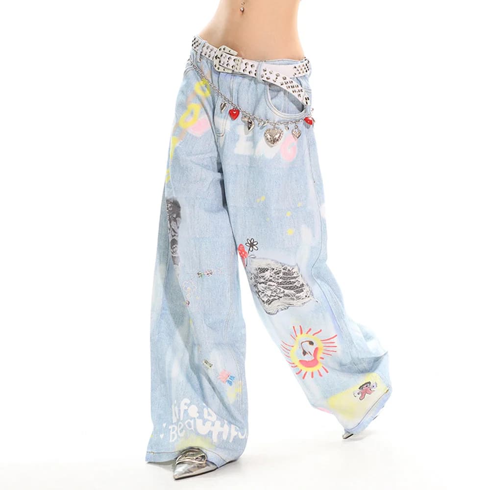
Graphic or printed pants present a unique styling challenge. If your trousers are printed with bold illustrations, wearing a loud statement accessory can create visual gridlock. In this scenario, the printed pants often serve as the true statement piece, requiring accessories to play a supporting, quiet role.
A prime example is the Indie Kid Mushroom Print Jeans in Blue denim. Because the whimsical mushroom print runs down the fabric, these jeans immediately grab attention. To avoid overwhelming the outfit, your accessories should mirror the denim's tones or stick to subtle neutrals: a simple narrow belt, a plain silver chain, and unadorned sneakers allow the jeans to stay center stage without feeling chaotic.
If you try to pair heavily illustrated pants with loud beaded necklaces, multi-pin vests, and neon hats all at once, the individual appeal of the print gets lost. Treat graphic bottoms as the outfit's visual anchor, keeping all supplementary jewelry and bags restrained and sleek.
- Let printed trousers act as the primary graphic hero of the entire ensemble.
- Use single-tone belts with simple square buckles that do not clash with pants patterns.
- Select bags in solid neutral tones like black, unbleached canvas, or washed denim.
Color Theory: Harmonizing Your Accessory Palette
Color harmony determines whether an indie outfit looks curated or messy. You do not need to match colors identically—monochrome matching can sometimes feel rigid or dated—but accessories should speak to at least one shade present in your garments. Using an anchor color ties disparate indie pieces together into a unified story.
Start by identifying the dominant hue and the secondary accent color in your clothing. If your top features touches of forest green and creamy white, selecting an accessory that incorporates cream or silver will establish a smooth dialogue between clothing and jewelry. Throwing an unexpected neon orange bag into that mix without any other warm tones can look accidental rather than deliberate.
When you want an accessory to truly stand out, use intentional contrast rather than random selection. A single bright red accessory worn against a predominantly muted olive or slate outfit creates an instant focal point. The contrast works because the background remains consistent, allowing the accent color to command full attention.
- Identify the primary tone and secondary accent color before picking jewelry.
- Use high contrast (bright against muted) intentionally to mark your single focal piece.
- Limit the overall outfit palette to three main color families to avoid visual muddiness.
Common Pitfalls: How Indie Accessorizing Goes Wrong
The most frequent misstep in indie styling is the 'everything at once' trap. It is tempting to wear your favorite pins, layered necklaces, patterned bucket hat, chunky rings, charm belt, and printed socks simultaneously. However, when every zone of your body carries a high-contrast novelty item, none of them stand out, and your silhouetteThe overall shape an outfit creates, from fitted to loose and layered. loses clarity.
Another common error is ignoring hardware cohesion. While mixing gold and silver metals can be done successfully, doing so alongside colored plastic, burnished brass, and bright neon resin often produces a haphazard result. Try to keep your primary metal finishes within a similar family—like cool silvers and chrome—so different accessories feel like they belong in the same collection.
Lastly, forgetting about everyday ergonomics can ruin an outfit. Accessories that pinch, snag on loose knits, or feel heavy after an hour will distract you all day. Style must be wearable; a chunky chain that catches your hair or a belt buckle that digs into your stomach when seated will quickly end up left in your drawer.
- Over-accessorizing every zone: Avoid competing accents at head, waist, and feet at once.
- Hardware clash: Do not mix too many conflicting finishes, like brass, silver, and neon plastic.
- Physical discomfort: Steer clear of snag-prone chains and overly heavy belts for daily wear.
Shopping Evaluation: How to Compare Potential Pieces
When browsing new additions for your wardrobe, evaluating pieces based on versatility rather than novelty alone will save you money and closet space. Before buying a bold statement accessory, check whether you already own at least three outfits that can comfortably support it as the main focal point. If an item requires buying four other specific garments just to wear it once, it is rarely a smart purchase.
Examine materials and functional details closely. Check the product specifications for fabric composition: cotton blends offer breathable daily wear, while polyester components provide structural durability and shape retention. For metal accessories, inspect clasps and chain links for secure construction rather than flimsy wire that might bend under light tension.
Finally, ask yourself where the piece sits within your existing accessory rotation. If you already own three prominent waist belts, adding a fourth might be redundant. Instead, consider filling a genuine gap in your wardrobe—perhaps a clean, reliable tech cover or a subtle everyday chain that helps balance out your existing statement pieces.
- Three-outfit rule: Ensure the accessory pairs with at least three existing outfits.
- Check specs: Review materials (cotton, polyester, denim) for seasonal comfort and care needs.
- Identify gaps: Buy accessory categories you lack rather than duplicating items you already own.

The Outfit Assembly Checklist
Before heading out, run through this practical assembly checklist to confirm your accessories are working together seamlessly. Taking thirty seconds to audit your outfit prevents midday adjustments and ensures your chosen focal point shines with confidence.
First, identify your primary anchor piece clearly. Is it your belt, your necklace stack, your graphic jeans, or your tech case? Name it. If you cannot immediately tell which item is supposed to be the star, your outfit likely has too many competing elements. Step back, edit down, and let that chosen item have some breathing room.
Second, verify that your proportions and textures feel balanced. Check that your hemlines don't obscure your footwear details, that your top neckline frames your jewelry cleanly, and that your bag sits comfortably without interrupting your waistline. When each item has its dedicated space, your indie look will feel cohesive, relaxed, and uniquely your own.
- Focal check: Can you name the single anchor piece of your outfit within two seconds?
- Neckline review: Does your shirt collar leave enough clean space for your jewelry to show?
- Proportion scan: Do your skirt or trouser hems frame your shoes and socks properly?
- Hardware scan: Do your metal finishes complement each other rather than clash?
- Comfort test: Can you sit, walk, and move freely without jewelry snagging or pinching?