Created by the Kawaii Vibe editorial team. Our named style desks are editorial personas. Product details and availability can change.
The quick answer: decide on one anchor sticker, two supporting sizes and a colour limit before you peel anything. Place the big one first, fill around it with smaller pieces, and leave about a third of the page empty. That one habit is the difference between a spread that looks planned and one that looks crowded.
This guide walks through the whole process for cute stationery stickers, from sketching a rough layout to matching your page to the colours you are actually wearing that week. It is written for everyday journalers, not perfectionists, so there are fixes for mistakes too.
Where it helps, we point to pieces from the shop as optional ideas. Nothing here requires a specific purchase. A single sheet and a bit of planning will do more than ten packs used at random.
Plan first, peel second
Stickers are the one journal tool you cannot fully undo, so the best habit is a dry run. Lay your sheet next to the open page and slide the stickers around without peeling them. Take a photo on your phone when you like an arrangement. That photo becomes your map, and you can rebuild it in a couple of minutes.
If your stickers are still on the backing sheet, you can cut around groups with scissors and move the small clusters as one piece. Otherwise, a sheet of baking paper or a scrap of tracing paper works as a temporary surface. Put the sticker on it, move it about on the page, and stick it down only when it feels right. Only try this on a scrap first, because every adhesive behaves a little differently.
The point of planning is not to make everything rigid. It is to remove the guessing. When you know where the anchor goes and roughly how many stickers you will use, each placement stops being a big decision. Most people overstick because they decide one sticker at a time, and each one looks lonely. Deciding the total count first, say six to nine on a single page, keeps the page calm even when the stickers themselves are loud.
Give the spread one job
A spread that tries to be a diary, a to-do list and a mood board at once usually ends up cluttered. Pick one job: a weekly plan, a trip log, a gratitude page, a monthly recap, or a simple pretty page for photos. The job decides how much room your writing needs, and your writing always gets space first.
A weekly plan needs lines or boxes for seven days, so stickers go in the margins, the header and the corners. A trip page might be mostly photos and ticket stubs, so stickers act as little connectors between them. A mood page can be sticker-heavy, but it still benefits from one clear focal point. Write the job in pencil at the top corner if you tend to wander.
Think of stickers as seasoning, not the meal. On a planning page, stickers can mark things that matter, like a birthday, a deadline or a day off. On a memory page, they can sit near the event they match. If a sticker does not point at anything or frame anything, it is decoration, and decoration should be the last layer you add. Once the job is clear, choosing what to stick becomes much easier.
A simple layout skeleton
Try the anchor-and-triangle layout. Choose your largest sticker and place it off-centre, roughly a third of the way in from one side. Then put a medium sticker on the opposite side, a bit higher or lower, and a small one near the third corner. Your eye travels around that triangle, so the page feels balanced without being symmetrical.
On a two-page spread, treat each page differently but link them. Put the anchor on the left page and echo it with a medium sticker on the right, near the gutter or the outer edge. Letting a small sticker or a strip of tape cross the centre fold ties both sides together. Do not put anything important right in the fold, because it will crease and sometimes peel as the book flexes.
Keep your text blocks in mind as shapes too. A paragraph of handwriting is a rectangle of visual weight. Place stickers so they touch the corners or edges of that rectangle rather than floating in the middle of nowhere. If two sticker clusters sit on the same diagonal, that is usually enough. A third cluster on the same side tips the page into heavy territory, so stop and look before adding it.

Sticker sizing: use three sizes only
Limiting yourself to three sizes keeps the page coherent. Call them anchor, support and dot. The anchor is the biggest sticker on the sheet and should appear once, maybe twice on a full spread. Supports are about half that scale. Dots are the tiny filler pieces, such as stars, hearts or small icons, used to repeat a motif.
A handy way to check proportion is the thumb test. If a sticker is bigger than your palm, it is an anchor and needs space around it. If it is about the size of your thumb, it is a support. If it is smaller than a thumbnail, treat it as a dot. These are only rough guides, since journals come in different sizes, but they help you compare stickers across different sheets.
Mixing sheets is where sizing goes wrong. One pack may have huge characters and another may have tiny icons, and putting them together can look random. If you mix, make sure at least one sticker size overlaps between the two, or use the smaller sheet only for dots. Browsing the full range of cute kawaii stickers is easier when you already know whether you need an anchor piece or a pack of small fillers. Check the sheet photo before buying and count how many pieces fall into each size.
Colour limits that keep a page tidy
The easiest rule is three colours plus a neutral. Pick three main hues from your stickers, such as pink, mint and butter yellow, and let white, cream, black or grey be the neutral that carries your writing. Anything outside those colours either gets skipped or used only once as a small surprise.
Notice that stickers rarely contain only one colour. A pastel character might have outlines in brown or grey and a bright cheek. Look at the dominant colour, not every detail. If two stickers share the same dominant tone, they will sit well together even if their styles differ a bit. If the dominant tones fight, such as neon orange beside dusty lavender, give each its own page or separate them with white space.
Your pens and tape count as colour too. A black pen on a pastel page reads crisp, while a coloured pen should match one of your three hues. Washi tape in a fourth colour is the most common reason a page feels off. If you are unsure, hold the tape next to the stickers and squint. If one of them jumps out, put it away. A neutral page with a single strong colour can look more deliberate than a rainbow, and it is the safest route for beginners.
Matching your page to your outfit palette
Here is a fun way to choose colours without overthinking: borrow them from what you are wearing, or what you plan to wear this week. Take a quick look at your outfit and name the three main colours. A cream knit, sage cardigan and brown bag gives you cream, sage and brown. Your journal page then uses sage-leaning stickers, cream paper space and brown or dark pen.
Try a few pairings. A pale pink hoodie with light-wash jeans and white trainers points to pink, soft blue and white, which suits pastel animal and sweet-treat stickers. A black tee with a grey skirt and silver jewellery suggests monochrome stickers with one accent colour, perhaps red, repeated three times. A mustard jumper with olive trousers leans toward warm retro stickers in mustard, olive and cream.
This works as a weekly ritual. Plan your spread on Sunday, or whenever your week starts, and let your usual wardrobe do the colour work. It also helps if you carry your journal in a bag, because the cover, the page and your outfit then feel related. If your wardrobe is mostly neutral, use the journal as your colour moment, choosing one accent shade that also appears in a small accessory like a hair clip or a phone case. Matching does not need to be exact. Two out of three colours in common is already enough to look intentional.
Spacing and breathing room
Spacing is the quiet half of sticker design. A good rule is to leave at least the width of your fingertip between stickers, and more around an anchor. Crowding makes even cute pieces look messy, because the eye cannot rest on any one of them. If you are tempted to fill a gap, ask whether the gap is helping the page breathe. Often it is.
Edges deserve attention too. Keep stickers a small distance from the trimmed edge of the page, so they do not catch on pockets or other pages. Avoid putting stickers directly on the page edge where they may lift when you flip. Stickers that hang over the edge can look playful, but they are also the first to peel, so use that trick only on a page you do not mind losing.
Try the one-third emptiness test. After you finish, squint at the page. About a third should look blank or at least calm, such as plain paper, lines or handwriting. If the whole page is busy, remove a sticker, or move two clusters apart. You can lift a fresh sticker gently with a fingernail or a flat tool and reposition it, but older ones may tear paper. Leave the odd empty patch for later notes, because pages rarely stay finished.
Layering with writing, tape and paper bits
Stickers look best when they interact with other elements. Put a small sticker so it overlaps the corner of a photo, a ticket or a strip of washi tape. This creates depth and stops the sticker from looking like it is floating. Overlap only a little, around a quarter of the sticker, so the design stays readable.
Writing should usually sit on top of blank paper, not on top of stickers. If you must write near a sticker, finish the writing first, then place the sticker so it frames the words. Pens can smear on glossy surfaces, and some inks do not dry quickly on them, so test on a spare sticker if you plan to write over one. Use headers and short labels beside stickers, such as a date in a speech bubble shape or a short caption underneath.
Add layers in a fixed order: paper pieces first, tape second, stickers third, pen last. That order stops you from covering a sticker with tape that tugs at it later. Keep the number of layer types to two or three per page. A page with photos, tape, stickers, stamps, clippings and doodles is no longer a layout, it is a collage, and collage is lovely, but it needs a different plan. If you want more tools for this step, the stationery collection has a range of everyday pieces to browse.
Choosing sticker themes for the page job
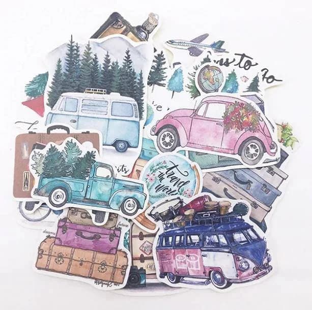
Match the theme to the job. For trip logs, a pack like the Travel Journal Stickers could suit the photo and ticket side of a spread, acting as little labels and dividers around your mementos. For general mood pages, the Aesthetic Vibes Stickers could work as a flexible all-rounder, especially if you want a mix that sits well with a neutral outfit palette.
Think about how many pages each pack needs to cover. A themed pack is easiest when you plan to use it across a whole month or trip. A mixed pack suits one-off pages and makes sense if you change styles often. Look at the product photo and count how many anchor-style pieces you see. If there is only one large sticker, that pack will serve one spread, not five.
Keep the pack and the page honest about each other. Do not buy a travel pack hoping it will make a weekly planner feel like a holiday. Pick packs that reflect what you will actually write about. If you are building a small collection, start with one themed pack for your main use and one simple pack of dots and symbols for everything else. You can browse more themed sheets in the wider aesthetic stationery collection before deciding.

Funny and character stickers as accents
Character stickers carry personality, which is great and also a risk. A single funny face or animal can make a page, but five of them compete. Treat character stickers as the anchor or the support, never the dots. Let one be the star and let the others be quiet plants.
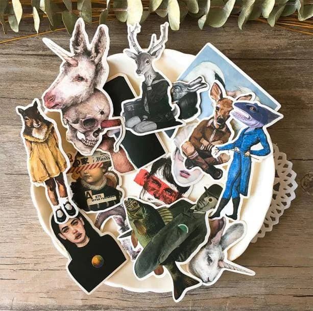
The Funny Art Stickers could be a good choice for a page where you want a joke or a mood label, such as a rough-week recap or a messy to-do list. Pair a single one with plain handwriting so the humour lands. The Animal People Stickers might suit a social page, like a friends catch-up or a plan for a group event, where each character could stand in for a person or a mood.
Use their expressions as part of your layout. Characters that look sideways can point toward your text, while ones that face outward can sit on the edge as if they are watching the page. Face them inward toward the content so they guide the reader. If a character looks off the page, it pulls attention away from your writing. Keep the colour limit in mind as well: if a character has a bright colour that is not in your three, use it once, with plenty of space around it, as a deliberate pop rather than a theme.

Retro and high-contrast pages
Not every page has to be soft. A contrast page can feel fresh in the middle of a pastel journal, and it gives your eyes a break. Retro, glitchy or bold-colour stickers work best when you treat them as a separate chapter rather than mixing them into every spread.
The Vaporwave Retro Stickers could suit a page about music, screens, late-night plans or anything with a nostalgic feel. Keep the colour rule even tighter here, perhaps two hues plus a neutral, because retro designs tend to bring many colours with them. Dark paper or a plain white page helps them stand out, and a minimal layout with one anchor and a few dots is usually enough.
If you want the contrast to feel connected to the rest of your journal, repeat one element from your softer pages. That might be the same pen colour, the same tape, or the same corner placement for the date. Repeating something small makes the shift in mood look intentional. Outfit matching still works: a bold graphic tee or a dark jacket can inspire the contrast page, while a soft knit inspires the quiet one. Think of your journal as a wardrobe, with daily wear and a few statement pieces.

Paper, tools and fixing mistakes
Paper affects everything. Thin pages can wrinkle under big stickers, and heavy sticker coverage on one side can make the other side bulge. If your journal paper is thin, use fewer large stickers and keep them away from the fold. We do not list paper details for the stickers here, so check each product page for what is provided, and test a spare piece before committing to a favourite page.
A small toolkit helps: tweezers for tiny pieces, a ruler for alignment, a pencil for light guidelines, and a flat tool like a plastic card for pressing edges down. Press from the centre outward so air does not get trapped. Wipe your fingers if they are oily or sticky, because grime on the adhesive side shows up as lifted edges later.
When something goes wrong, stay calm. If a sticker is crooked, lift it right away, slowly, and reposition it. If it has already stuck hard, you can cover the mistake with a larger sticker, a strip of tape or a hand-drawn frame. Turn the error into a design feature, such as adding a small shadow line or a doodle that follows the tilt. Many journalers keep a few spare stickers just for this purpose. Store unused sheets flat in a folder or the original sleeve so they stay ready for the next page.
Common pitfalls and how to compare packs
The first pitfall is buying by cuteness alone. A sheet can be adorable and still give you nothing to use, such as twenty tiny faces and no anchor. Before buying, look at the picture and sort the pieces into anchors, supports and dots. A useful pack has a mix. The second pitfall is style clash: grunge, cottagecore, and pastel pieces rarely sit well on one page.
Compare packs using a few plain questions. How many different colours dominate? Are the sizes varied? Does the theme match what you write about? Does it work with the palette of your wardrobe or desk? Check the product page for what is actually listed, since details such as material or finish may not be provided, and do not assume. Items labelled as one size and as pictured mean you should judge by the photo.
A third pitfall is using everything at once. A new sheet feels like a treat, and it is tempting to cover a page in an afternoon. Spread a pack across several pages, and you get more value and a more consistent look. If you like edgier or darker styles, packs such as the Aesthetic Edgy Stickers are best treated like accent pieces, used sparingly against calm backgrounds. Small add-ons from the little accessories under 10 range can round out a set without a big spend.

A pre-sticker checklist and simple budget plan
Before you peel anything, run through this quick list. It takes under two minutes and will save you most regrets. Do it each time until it becomes automatic, and adjust it to your own habits and journal size.
On budget, you do not need a huge stash. A starter kit of one anchor-heavy pack, one pack of small dots, a neutral pen and a roll of plain tape covers most pages. Add a themed pack only when you have a clear page job for it. If you are shopping around, the stationery collection and the kawaii stickers range are good places to compare options side by side, and you can keep price in view as you go.
Finally, give yourself permission to be imperfect. A page with a wonky star and a smudge still tells your story. The planning steps are there to reduce stress, not add rules. If a layout feels good when you look at it, it is done. Close the book, check how your palette lines up with your next outfit, and leave the rest of the sheet for another day.
Here is the checklist to copy into the back of your journal:
- Name the page job before choosing stickers.
- Pick one anchor, two or three supports and a few dots.
- Set a colour limit: three hues plus a neutral.
- Borrow those hues from your outfit or accessories if you like.
- Dry-fit everything and take a photo of the layout.
- Leave about a third of the page calm and empty.
- Check the fold and edges are clear of key stickers.
- Add layers in order: paper, tape, stickers, pen.
- Store leftover sheets flat for the next spread.