Created by the Kawaii Vibe editorial team. Our named style desks are editorial personas. Product details and availability can change.
Short answer: pick one job for your stickers, leave a clear gap around your writing, and cap each page at a number you set before you start. That alone fixes most cluttered spreads. Cute pages usually go wrong because every sticker gets treated as decoration, so nothing has room to stand out.
This guide is for anyone who loves kawaii stickers for planner pages but ends up with a week that looks busy and reads badly. We'll cover spacing, sticker jobs, theme rules, and six sample layouts. Nothing here needs a special planner or a big haul.
Emi · The Cute Things Desk is an editorial voice, and we're a retailer, not a manufacturer. We haven't tested products for this guide, so we only describe what the listings show. Sizes and sheet contents are not specified for the stickers below, so check each product page before you plan around them.
The one-rule version: give every sticker a job
Before you peel anything, decide what the sticker is doing. There are really only three jobs: marking something (a deadline, a payday, a birthday), organizing something (a category, a section, a header), or decorating (pure cute). Cluttered pages are almost always 90 percent decoration with no marking or organizing at all.
A good starting split is one functional sticker for every decorative one. If you place a tiny character beside a dentist appointment, it works twice: you notice the appointment and you get the cute. If you place five characters in the corner of an empty box, you only get the cute, and the box now has less space for writing.
Try this on your next page. Write your tasks first, in pen, then look for the two or three items that would benefit from a visual flag. Those get stickers. Everything else stays clean. It feels restrained at first, but the stickers you do add suddenly look intentional rather than scattered.
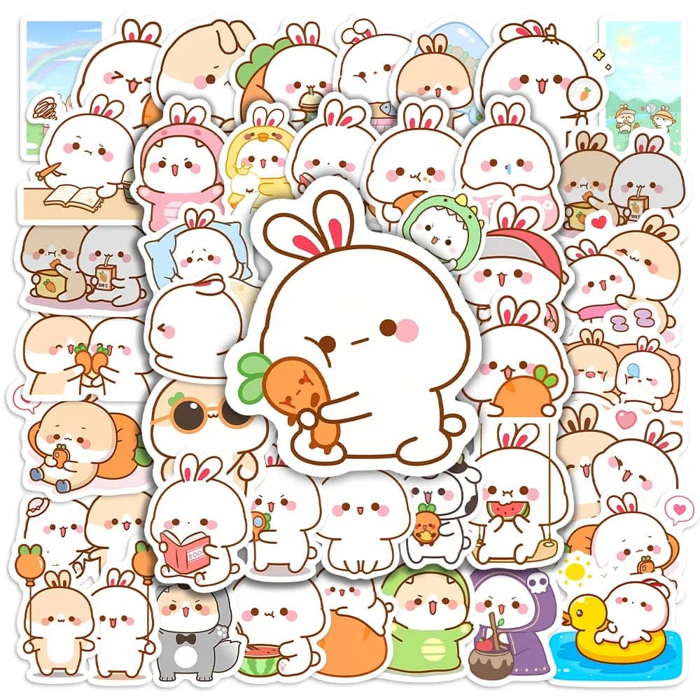
If you're still building your supply, the Kawaii Stickers collection is a handy place to compare styles side by side before you commit to one look.
- Marking: deadlines, events, bills, reminders
- Organizing: headers, categories, habit rows
- Decorating: corners, gaps, page edges only
Spacing rules that keep pages readable
The simplest spacing rule is the thumb test. Leave roughly a thumb's width of empty space between a sticker and any handwriting. It's not a measured standard, just a quick eyeball check you can do with your own hand. If your writing touches the sticker edge, it's too close.
Next, think in clusters. One sticker alone looks calm. Three stickers in a tight group look like a deliberate cluster. Two stickers on opposite corners with nothing between them look accidental. Either group them or place them with a clear reason, like anchoring the top and bottom of a column.
Keep your biggest sticker away from the busiest part of the page. If the middle of your weekly spread is where you write, push larger pieces to margins, header strips or the blank space at the end of a column. Small stickers can sit closer to the action because they don't compete with text.
A last habit: leave at least one section on each spread with nothing on it. Empty space is what makes the cute parts look cute. When every inch is filled, the eye has nowhere to rest and the whole page reads as noise.
- Thumb's width between sticker and writing
- Group in odd numbers or anchor opposite ends
- Large stickers go in margins, small ones near text
- Keep one deliberately empty zone per spread
Sticker size and where it belongs
Match sticker size to the space it lives in. A tiny sticker in a daily box works as a flag. A medium sticker in a header works as a label. A large sticker belongs on a divider page, a monthly cover or a note area where there's no writing to fight with. Mixing sizes is fine, but each size should have a home.
A common pitfall is putting a medium sticker in a small box. It covers the lines, forces you to write around it, and you end up squeezing text. If a sticker takes up more than about a third of a box (judge by eye), trim it, move it, or save it for a bigger spot.
You can also use size to signal importance. If your big sticker always means a major event, you'll learn to read the page at a glance. Small stickers can be your everyday flags. This only works if you stay consistent, so choose it once and stick with it for the month.
Because sheet contents and sticker dimensions aren't listed for many items, hold a sticker against your planner box before you buy more of the same style, or compare against a sheet you already own.

Functional sticker habits worth borrowing
Functional use is where stickers earn their keep. Pick a few repeatable meanings: one character for payday, another for appointments, a third for a deadline. After a week, you can scan the spread and know what's happening without reading a word.
Another habit is the progress marker. Place a sticker at the start of a long project and another at the finish line, then fill in the steps between by hand. It gives a goal a visible beginning and end without turning the middle into a collage.
You can also use stickers as page tabs. Stick one half over the page edge so it shows when the planner is closed, marking monthly starts or a notes section. Check that it won't snag on the cover when you close the book, and keep it smaller than the page margin allows.
Finally, reward stickers. Keep two or three for completed tasks only. Putting one on a finished item feels good, and it limits how many you can use, which is exactly the point.
- One character, one meaning, per month
- Start and finish markers for projects
- Edge tabs for sections
- Reward stickers for finished tasks only
Theme rules: choose a lane for each month
Theme rules are what stop a page from looking like a sticker sale bin. Choose one lane per month: a color family, a character type, or a mood. Everything you place has to fit that lane, and anything that doesn't goes back in the sheet for next time.
A color lane is the easiest. If you choose soft pinks and creams, a loud green sticker will stick out, so skip it. A character lane works well too: all animals, all food, all abstract shapes. A mood lane, like calm or moody, takes more judgment but gives a more personal result.
You can allow one wildcard per spread. That's a single sticker that breaks the theme on purpose, like a surprise. It reads as humor rather than mess because everything around it is consistent.
If you like varied styles, rotate lanes monthly rather than mixing them in the same week. You still get variety over a quarter without any one page looking chaotic.
- One lane per month: color, character or mood
- Maximum one wildcard sticker per spread
- Rotate styles between months, not within a week

Sample layout 1: the weekly spread
Here's a simple weekly layout. Seven columns, or a vertical list, with writing in the main area. Place one small functional sticker at the top of each day that has a fixed commitment. Leave the other days bare. At the bottom or side margin, add one medium decorative piece as an anchor.
Total count for the spread: around five to seven stickers. That's a guideline, not a rule, so adjust it to your page size. The point is that the number is set before you begin, which keeps you from adding just one more until the page is full.
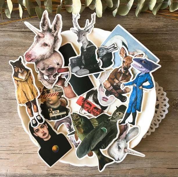
If you like a slightly quirky, humorous look, a sheet such as Funny Art Stickers could serve as the decorative anchor in the margin, while smaller flags come from a cuter sheet. Product details like sticker count aren't listed, so the listing images are your guide.
Check the layout by closing the planner and opening it again after an hour. If your eye goes to the stickers before the tasks, remove one.
Sample layout 2: the monthly overview
Monthly grids have tiny boxes, so the rule here is almost nothing in the boxes and most of the character in the header and side area. Put a single sticker on key dates only: paydays, trips, birthdays. Everything else stays as text.
Use the header strip for your theme moment. A larger sticker or a small cluster of two or three sets the mood without touching the grid. If your planner has a notes column, place a medium piece there to balance the weight.
For a softer, dreamy header, Aesthetic Vibes Stickers might suit that top strip, as long as the style fits your month's lane. As the listing offers one option, as pictured, check the images to see whether the tone matches your pages.
Keep a short key at the bottom: one line saying what each repeated sticker means. It takes ten seconds and saves you from guessing later.


Sample layout 3: the daily page
Daily pages give you more room, but more room invites more clutter. Divide the page into three zones: a header, a task area and a notes area. Stickers go in the header and on individual tasks, never across the whole task area.
A good pattern is one header sticker, up to two task flags, and one small reward sticker waiting at the bottom for when you finish. That's four at most, and each has a clear reason to exist.
If your style leans darker or more graphic, something like Aesthetic Edgy Stickers could work for header pieces on days that need a moodier tone. Keep the flags in the same lane, so the page doesn't split into two different looks.
Leave the notes area completely clear. It's where you'll want to write fast, and stickers there slow you down.

Sample layout 4: habit tracker and mood log
Trackers are the easiest place to over-sticker because the boxes repeat. The fix is to use stickers as the legend, not the fill. Put one sticker beside each habit label, then mark progress with a pen dot or colored pencil rather than a sticker per day.
If you do want a sticker per completion, make it a tiny one and use it only for a milestone, like a full week. This keeps the grid readable and makes the milestone feel like an event.
For a mood log, assign a character or style to each mood and use a tiny sticker only on days that stand out. Over a month you'll see a pattern of highlights, rather than a wall of identical pieces.
Animal-themed sheets such as Animal People Stickers could work as habit labels if you want a character beside each routine. Since details aren't listed beyond the pictured design, preview the characters first and make sure they're distinct enough to tell apart.
- Sticker on the label, pen mark in the box
- Tiny stickers for milestones only
- Mood stickers for standout days

Sample layout 5: the notes and dividers page
Divider pages and note spreads are where you can be bolder, because there's no daily writing to protect. A single large sticker or a tidy cluster of three works as a cover for a section. Give it a handwritten title, and stop there.
If you prefer a retro or dreamy look, Vaporwave Retro Stickers might suit a dedicated divider spread. Using one style on dividers also helps you flip to sections fast, because each has a recognizable look.
Another option is the art-inspired route. Van Gogh Stickers could be a calm choice for a reading list or journaling section, as long as the pictured designs fit your lane. We can't speak to anything beyond what the listing shows.
Whatever you use, keep dividers consistent for the whole planner, so the look stays tidy even when daily pages shift styles.
Sample layout 6: the quiet page for busy weeks
Some weeks are packed. On those, strip back to a minimal layout: one header sticker, deadline flags only, and no decorative extras. The page will still feel cute because the few stickers you used stand out against clear writing.
This is also the time to use your strictest theme rule. Choose a single color or character and use only that. Fewer decisions, less visual noise, and you still get the small lift of a sticker on a hard day.
If you enjoy odd or surreal designs, a sheet like Weirdcore Stickers could suit a deliberately sparse page, where one strange sticker acts as the entire decoration. The same goes for Aesthetic Death Stickers if you like a darker twist, though it's worth checking the listing images so the tone matches how you want the week to feel.
Aim for three stickers or fewer. Once the week calms down, you can bring the extras back.
How to compare sticker options before buying
Start with the images. Because many listings show one option, as pictured, and don't give measurements or materials, the photos are your main evidence. Look at the variety of shapes, whether there are small flag-sized pieces, and whether there's a mix of sizes or only large ones.
Then ask what job the sheet would do. A sheet of only large illustrations is great for dividers and headers but weak for task flags. A sheet of tiny icons is great for tracking but may lack a focal piece. Ideally you own one of each type, and you can browse more in the Stationery collection to pair stickers with notebooks and planners.
Check style fit with your current supplies. A pastel set next to a gritty graphic set can look mismatched, so decide your lane first. If you're buying on a budget, the Little Accessories collection is worth a look for small add-ons.
Avoid assumptions about finish, adhesive or paper compatibility. If a listing doesn't mention it, don't assume it. Try a sticker on a spare page before using it on a favorite spread.
- Look for a mix of tiny, medium and large pieces
- Match the sheet to a job, not just a vibe
- Check lane fit with what you already own
- Test on a spare page if unsure
Common mistakes and quick fixes
The biggest mistake is placing stickers before writing. You end up writing around them and cramming text into odd shapes. Write first, then add stickers into the leftover space with intention.
The second is overlapping stickers without a plan. LayeringWearing pieces over or under one another to add depth, warmth or contrast. can look lovely, but only when it's deliberate. If stickers overlap by accident, peel one and reposition it, or cover the area with a single bigger piece. Be gentle if you want to move one, since we can't promise how any sticker will lift from paper.
The third is chasing every new sheet. Buying more doesn't fix clutter; rules do. Using a smaller set across several months teaches you what you really reach for.
The fourth is ignoring the back of the page. If your paper is thin, a sticker near the edge may show through or affect the other side. Check before committing, and keep a thicker spare page for testing.

A pre-sticker checklist and where to start
Here's a quick checklist to run through before any page. It takes under a minute and pays off every time. Print it, write it on a sticky note, or keep it on the inside cover of your planner.
If you want somewhere to start, grab one sheet for flags and one for headers from the Kawaii Stickers collection, then browse planner-friendly stationery to match a notebook or pen set to your theme lane. Keep it simple for the first month and adjust what bugs you.
The goal isn't a bare page. It's a page where the cute parts and the useful parts both get noticed. Set your rules, stay inside them, and let the stickers be the highlight rather than the whole show.
- Did I write my tasks first?
- Does each sticker have a job: mark, organize or decorate?
- Is there a thumb's width around the writing?
- Is everything inside this month's lane, with one wildcard at most?
- Is my sticker count set for the page?
- Is one zone left empty?
- Have I tested any unfamiliar sticker on a spare page?