Created by the Kawaii Vibe editorial team. Our named style desks are editorial personas. Product details and availability can change.
Wearing light blue accents around your collarbone sounds simple until your pieces fight with your neckline, tangle together, or disappear into pale fabric. Soft blue shades—whether found in milky resin, glass beads, pale enamel, or icy stones—have a muted quality that requires thoughtful framing. When done right, they add a quiet pop of cool color that keeps an outfit feeling fresh and airy.
The trick to styling pastel blue jewelry is balancing three elements: neckline architecture, metal temperature, and physical spacing between layers. When your garments offer clean lines, your jewelry can hold its own without demanding heavy bulk. You do not need dozens of chains to make an impact; thoughtful arrangements bring out subtle blue hues far better than cluttered stacks.
This guide breaks down exactly how to pair light blue pendants and chokers with specific collars, how to choose between silver and warm metals, and how to stop multi-strand necklaces from bunching into knots. We will also look at how to frame blue jewelry against casual streetwear staples to keep your everyday rotation crisp.

The Mechanics of Pastel Blue: Pale Color Saturation and Contrast
Pastel blue sits at a very specific value point on the color spectrum. Because it contains significant white tint, its visual weight is light and delicate. If you drop a pale blue charm against an off-white cotton tee, it often washes out from a distance. Conversely, if you drop it over pitch black without an intermediary metal frame, the contrast can feel harsh and disjointed. Achieving the right visual presence requires understanding surface contrast.
When you style pieces from the Pastel Blue Jewelry collection, look at how the blue element is framed. Is the stone or enamel surrounded by metallic edging, or is it a standalone bead on a cord? Metal borders act as visual punctuation marks, separating the soft color from your skin or clothing. If you wear pastel blue beads directly against bare skin, your natural undertone provides that separation. When worn over tops, you will want slight tonal separation—such as pairing ice-blue gems with charcoal, cream, navy, or soft heather grey.
Spacing also influences how intense the color feels. A solitary light blue pendant concentrates color into one focal area, drawing the eye instantly. Spreading that same amount of pigment across a necklace made of tiny seed beads disperses the blue into a gentle mist of tone. Decide whether your jewelry is meant to act as a distinct pendant highlight or as an ambient texture alongside your clothing.
- Pale blue looks richest against mid-tone neutrals like slate grey, soft taupe, and raw denim.
- Metal bezels around baby blue stones create essential contrast against fair skin and pale fabrics.
- Dispersed blue beads create subtle color wash, while isolated focal stones create targeted focal points.
Pairing Pastel Blue with Crew Necks and High Collars
Crew necks and ribbed t-shirt collars are daily staples, but they present a common jewelry hurdle: where does the chain sit? If your necklace length places a pendant right on top of the stitched ribbed collar, the pendant will bounce, flip, and catch on the seam throughout the day. To solve this, your jewelry must sit decisively above the ribbing on bare skin or drop several inches below the seamline onto the flat chest panel.
For standard crew cuts, a shorter 14-inch to 16-inch chain stays cleanly tucked against the base of your throat, resting entirely on skin above the collar. This setup works exceptionally well for small blue enamel charms or micro-beads. Alternatively, you can opt for an 18-inch to 22-inch chain that suspends a blue stone securely onto the center of the shirt fabric, well below the neckband. This creates an elongated vertical anchor that breaks up wide cotton chest panels.
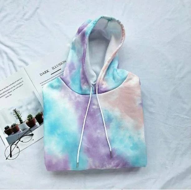
When styling a graphic or textured casual top, such as the Pastel Clouds Hoodie made of cotton and polyester, the hood construction and thick neckline require deliberate necklace placement. Tucking a thin chain inside the collar keeps the pendant subtle and protected from rubbing, while choosing small, dangling pieces from our Pastel Blue Earrings keeps the soft color accent focused higher up where the collar fabric will not smother it.
- Avoid chain lengths that rest directly across the raised stitching of a crew neck rib band.
- Keep choker-length blue pendants on skin above the neckline (14 to 15 inches).
- Drop focal pendants at least 2 inches below the crew collar using 18-to-22-inch chains.

Framing Pendants with Square, Sweetheart, and V-Neck Cuts
Open necklines provide a blank canvas of skin, giving light blue tones optimal clarity. However, each geometric cut requires a pendant shape that mirrors or complements its lines. A sharp V-neck naturally draws the gaze downward in an angular taper. Pairing a V-neck with a triangular, teardrop, or vertical bar pendant in pastel blue reinforces that clean directional pull without clashing.
Square necklines and sweetheart collars feature horizontal frames that can feel blunt if matched with an equally wide, rigid choker. Instead, pair square collars with curved or rounded blue accents, like oval cabochons or circular discs on fine chains that fall precisely into the open space. The curve softens the angular perimeter of the garment while filling the chest area symmetrically.
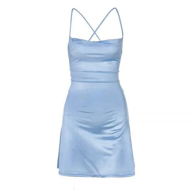
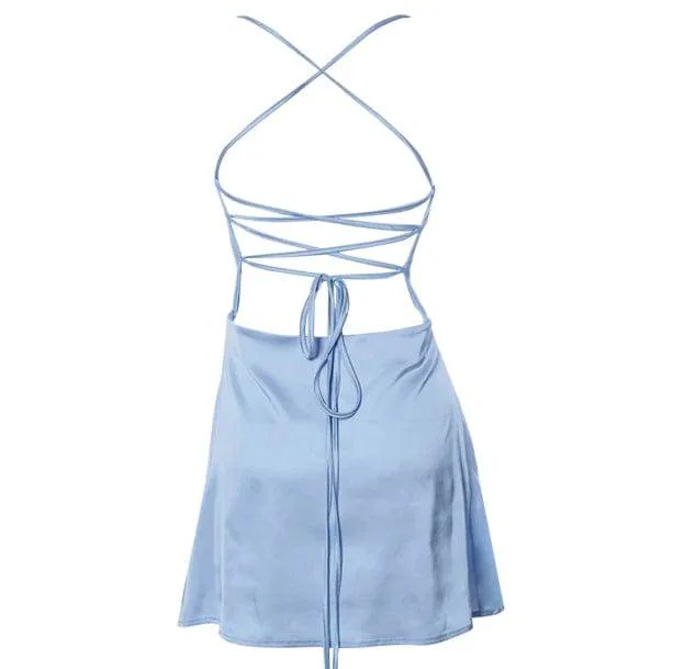
Consider how garments with dramatic cuts change jewelry balance. If you wear an open silhouetteThe overall shape an outfit creates, from fitted to loose and layered. like the Forever Dreaming Backless Blue Dress made of polyester, the deep cuts already command attention. In the front, a simple drop pendant centered in the neckline creates an effortless focal balance. Because the back of this piece is open, keeping your front necklace weight feather-light ensures the garment stays positioned properly without slipping forward.
Navigating Collared Shirts, Lapels, and Outerwear
Button-up shirts and collared jackets add structured layers that can swallow delicate accessories. When wearing a traditional button-down shirt, you have two primary options: button it all the way to the top and place a structured pastel blue necklace beneath the collar points like a tie accent, or unbutton two top buttons to create an open frame for your chain.
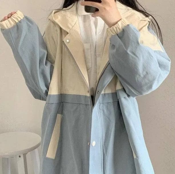
When the collar is unbuttoned, position your pendant so it floats in the negative spaceAn uncluttered area that gives the rest of a design room to stand out. between the lapels, never tucking halfway under the placket. If you layer structured outerwear over your top, your jewelry needs enough presence to avoid getting lost in the folds. For instance, pairing a light layer under the Blue Sky Aesthetic Rain Jacket means you need clean, durable chains that will not snag on synthetic zipper teeth or toggles.
If your outerwear has substantial bulk, shifting the blue focal point from the throat to the ears or wrists is often the cleanest solution. When heavy collars rub against the neck, swap out delicate necklaces for pieces found in Pastel Blue Accessories or compact blue studs that stay clear of movement-heavy collar folds.
- Tuck pendants fully inside an unbuttoned collar or place them intentionally over a fully buttoned placket.
- Avoid fine, snag-prone link chains beneath zip-up waterproof jackets or utility jackets.
- When outerwear lapels overlap heavily, shift soft blue tones to rings, hair clips, or structured ear cuffs.

Silver vs. Platinum: The Cool-Toned Harmony
Silver, white gold, and platinum are the most intuitive pairings for pastel blue. Because sky blue and icy tones contain blue undertones, cool metals maintain an uninterrupted aesthetic flow. Silver metals highlight the crisp, frost-like clarity of light blue glass, cubic zirconia, and pale chalcedony, making the entire combination feel sleek and modern.
The primary design choice when working with cool metals is the finish: high-polish shine versus brushed matte. High-polish sterling silver reflects ambient light, creating tiny sparkles that make pale blue stones look brighter and more crystalline. Matte or oxidized silver, on the other hand, introduces shadow and industrial texture, grounding light blue stones into an edgier street aesthetic.
When building a daily rotation of cool-toned pieces, consistency helps prevent clutter. If your pendant setting is bright, mirror-finish silver, pairing it with tarnished or dark gunmetal chains can create unintended visual dissonance. Sticking to bright silver allows baby blue enamel and milky beads to look clean, deliberate, and crisp against everyday clothing.
- Bright, polished silver emphasizes the chilly, crystal-like nature of pale blue stones.
- Matte grey metal tempers the sweetness of baby blue, shifting the look toward utilitarian street fashion.
- Cool metals seamlessly link light blue accessories with icy wash denim and cool white tees.
Yellow Gold and Warm Brass: Creating Contrast Without Clash
While cool metals provide tone-on-tone harmony, pairing pastel blue with yellow gold or warm brass creates rich contrast. Gold carries an inherent warmth that brings out the creamy, gentle qualities in powder blue. This combination feels reminiscent of vintage aesthetics, mid-century retro pastels, and sunshine breaking across clear skies.
To make gold and pastel blue work without clashing, pay attention to the saturation of the gold itself. Intense 24k yellow gold can occasionally overpower very pale blue, making the blue look dusty or washed out by comparison. A softer 14k gold, pale champagne gold, or satin-finished brass provides just enough warmth to flatter the blue without stealing the focus.
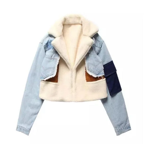
If you are wearing warm metal jewelry alongside patterned street apparel, consider how the rest of the outfit ties in. Wearing light denim with warm gold accents pairs naturally with textured separates. For example, wearing the Soft Girl Pastel Jacket allows warm gold chains with baby blue charms to bridge the gap between playful pastels and sophisticated metal accents.
- Choose soft 14k or champagne yellow gold over heavy brass to prevent overwhelming pale stones.
- Warm metals make baby blue feel softer, richer, and distinctly retro.
- Match warm gold jewelry hardware to belt buckles, bag grommets, or shoe eyelets for coherence.

Mixed Metals with Pastel Blue: Rules for a Cohesive Stack
Mixing silver and gold in a single outfit used to be considered a styling misstep, but it is actually one of the most effective ways to layer pastel blue jewelry. Because baby blue is a middle-ground cool tone, it can serve as a bridge between warm and cool metals when styled with intention.
The golden rule of mixed metals is intention: avoid a 50/50 split that looks accidental. Instead, designate one metal as the dominant base (roughly 70% of your look) and use the second metal as a deliberate accent (roughly 30%). For example, you might wear a primary silver chain stack, but feature a light blue pendant encased in a warm gold bezel. The blue stone anchors the warm pendant, while the silver chains tie in your silver rings and earrings.
Another seamless way to mix metals is incorporating two-tone chain links. A chain that alternates between silver and gold links provides an immediate visual justification for wearing blue gems mounted in either metal. This technique allows you to pull pieces freely from your collection without worrying about matching every individual clasp.
- Adopt a 70/30 ratio between dominant and accent metals to keep the arrangement purposeful.
- Use a pastel blue centerpiece to visually bridge contrasting silver and gold elements.
- Incorporate two-tone chains to harmonize mixed rings, bracelets, and collar layers.
The Three-Tier Rule: Stacking Chains Without Knots or Visual Clutter
The biggest frustration when stacking light blue necklaces is ending up with a tangled clump where chains cross, overlap, and hide the pendants. Successful layeringWearing pieces over or under one another to add depth, warmth or contrast. relies on the three-tier rule: distinct lengths, varied chain weights, and different focal types across each tier.
Tier one should sit close to the neck—between 14 and 15 inches. This tier works best as a simple textural base, such as a thin snake chain, a strand of micro-pearls, or a continuous line of miniature blue beads. Tier two drops to 16 or 18 inches and should provide intermediate weight, such as a paperclip or cable link chain that catches light. Tier three drops to 20 to 24 inches and carries your main focal element, such as a drop pendant from our Pastel Blue Necklaces collection.
By staggering each tier by at least two inches, you give every necklace room to move independently. Furthermore, varying the chain styles prevents the links from gripping each other and tangling into knots. If two chains have the identical link pattern and weight, they will inevitably twist together within minutes of walking.
- Tier 1 (14–15 in): Base choker, smooth snake chain, or micro seed beads.
- Tier 2 (16–18 in): Mid-weight chain with open links, such as a paperclip style.
- Tier 3 (20–24 in): Substantial drop pendant featuring your central pastel blue stone.
- Always leave a 2-inch gap between tiers to prevent chains from wrapping together.
Scale and Proportion: Chunky Beads vs. Delicate Filigree
Pastel blue can be adapted into bold statements or barely-there whispers depending on the scale of the materials. Large, chunky resin rings, heavy ceramic beads, and thick acrylic chains give light blue a playful, modern feel. Conversely, fine filigree metalwork, pavé crystals, and micro-beads make the same color appear delicate and vintage.
Balancing scale requires looking at your outfit's overall silhouetteThe overall shape an outfit creates, from fitted to loose and layered.. If you are wearing oversized street silhouetteThe overall shape an outfit creates, from fitted to loose and layered.s, such as the Sky Blue Street Style Jeans cut from cotton, ultra-tiny jewelry can vanish against the heavy denim texture. Pairing wide-leg street cuts with slightly chunkier blue chains or thicker enamel rings creates balanced visual weight between your clothing and accessories.
When wearing fine knitwear or lightweight dresses, scale your jewelry down accordingly. Heavy, thick blue beads can pull thin fabrics downward or look clunky against sheer textures. Match the physical gauge of your jewelry wires, links, and stones to the fabric weight of your outfit for an integrated look.
- Pair heavy cottons, denim, and oversized outerwear with chunkier blue beads or wide rings.
- Pair lightweight silks, fine knits, and chiffon with delicate wire wraps and micro-pendants.
- Balance one high-volume chunky piece with quiet, thin supporting accessories.
Monochrome Blue Outfits: Preventing Jewelry from Disappearing
Styling pastel blue jewelry over blue clothing is a classic monochromatic choice, but it carries a distinct risk: the jewelry can blend entirely into the fabric and become invisible. When color contrast is low, you must rely on texture, shine, and depth contrast to make your accessories stand out.
If you are wearing a cozy knit like the Blue Sky Sweater—made of polyester, acrylic, and nylon—the fabric has a soft, matte, fuzzy surface. A matte pastel blue bead necklace will get lost against that fuzzy yarn. Instead, choose a high-shine blue glass pendant, polished enamel, or faceted icy blue stones that reflect light. The gloss of the jewelry pops crisply against the matte knitwear.
Another effective method is using garments from the wider Pastel Blue Clothes range that feature pattern breaks. Graphic prints, white collar trims, or denim stitching provide natural visual boundaries where your jewelry can rest. By placing your blue pendant against a white panel or directly over the denim waistband, the piece stays defined while remaining within the monochrome color story.
Grounding Pastel Blue with Darker Street Silhouettes
Pastel blue does not have to be restricted to sweet, soft outfits. One of the sharpest styling directions is grounding pale blue jewelry against dark, utilitarian street pieces. Charcoal hoodies, faded black cargo pants, and structured denim provide a moody backdrop that makes pale blue pop with striking clarity.
When wearing bold statement bottoms like the 90s Blue Checkered Jeans or the Pastel Butterfly Wide Leg Jeans, you already have graphic visual energy running through the lower half of your outfit. A solid black baby tee or dark boxy crew neck on top creates a blank stage. Placing a cool silver chain with a pastel blue pendant against that dark fabric draws the eye upward and ties in the blue patterns below.
To make pastels work in an edgy street outfit, stick to geometric shapes. Swap floral motifs and curved hearts for clean geometric rectangles, blue signet rings, or industrial padlock charms filled with baby blue enamel. This keeps the color soft while ensuring the attitude stays firmly grounded in casual street culture.
- Use solid black, charcoal, or dark wash denim tops as high-contrast display mats for pale gems.
- Tie blue graphic elements on your pants directly to your necklace or earrings for a cohesive top-to-bottom link.
- Choose industrial, architectural, or geometric jewelry cuts to counter the sweetness of baby blue.
Earring and Necklace Balancing: Avoiding the Cluttered Frame
When you love light blue accents, the temptation can be to wear matching blue earrings, a blue necklace, blue hair clips, and blue rings all at once. However, clustering too many pale blue elements tightly around your head and jawline creates visual clutter that diminishes the impact of individual pieces.
The key to balancing your face frame is establishing a clear hero piece. If you choose long, expressive dangles from our Pastel Blue Earrings collection, let your neck stay bare or wear a simple, unadorned silver collarbone chain. The earrings provide all the color and movement your jawline needs. If you add a multi-layered blue necklace on top of that, your collar area will feel crowded.
Conversely, if you are wearing a multi-tiered necklace stack packed with light blue pendants, keep your earrings minimal. Simple silver huggies, diamond-like studs, or tiny cool-toned cuffs keep your earlobes neat while allowing your layered necklace arrangement to serve as the undisputed focal point of your outfit.
- Pick one focal zone per outfit: either statement earrings or a multi-strand necklace stack.
- Pair bold blue drop earrings with an unadorned neckline or a minimal skin-tone choker.
- Anchor busy necklace stacks with plain metallic studs or tiny silver huggies.
Common Pitfalls When Styling Pastel Blue Accessories
A frequent pitfall when styling pastel jewelry is mismatched blue undertones. Not all light blues are created equal; some lean toward a green-tinted mint or seafoam, while others lean toward a red-tinted periwinkle, and others are pure icy sky blue. Mixing a green-leaning turquoise pastel with a purple-leaning periwinkle in the same necklace stack can make the pieces look mismatched rather than intentional.
Another common error is ignoring necklace weight balance. When layeringWearing pieces over or under one another to add depth, warmth or contrast. multiple fine chains, adding a pendant that is too heavy to a delicate chain will pull the entire stack into a tight V-shape, forcing the outer chains to collapse inward and tangle. Make sure your longest chain is sturdy enough to anchor its pendant without pulling down your shorter accent layers.
Finally, avoid wearing pale blue jewelry against fabrics that cause friction-induced static or shedding. Loose angora, cheap acrylic fleeces, or fuzzy mohair will catch on prong settings and shed fibers over pale stones, quickly dulling their shine. Pair delicate stone settings with tightly woven cottons, smooth denims, or sleek knits that let your pieces shine uninterrupted.
- Check your undertones: keep icy blues, periwinkles, and aqua pastels in distinct styling lanes.
- Match chain gauge to pendant weight so the bottom necklace does not drag the entire stack down.
- Steer clear of high-shed fabrics that snag on metal prongs and coat light blue stones in fuzz.
Daily Styling Checklist for Clean Blue Accents
Before heading out the door, take a moment to evaluate your jewelry arrangement in a full-length mirror. A quick scan ensures that your light blue accents are positioned properly, comfortable to wear, and doing justice to your overall outfit.
Start by checking your neckline spacing. Ensure your pendant is either fully resting against bare skin or lying completely flat against your shirt fabric. If it is hopping across a collar seam or slipping halfway under a lapel, adjust the clasp extender or switch to a different chain length immediately.
Next, test your layer separation by tilting your head and moving your shoulders. If your chains instantly wrap around one another, swap out the middle chain for one with a different link weight or remove a tier. Finally, verify that your metal tones feel balanced and that your blue accessories stand out against your top rather than fading into the background.
- Are your necklace lengths separated by at least 2 inches to stop tangles before they start?
- Is your pendant resting clearly on skin or clearly on fabric, away from collar seams?
- Do your light blue stones contrast sufficiently against the color and texture of your top?
- Did you limit your statement pieces to either your ears or your neckline, avoiding face-frame clutter?