Created by the Kawaii Vibe editorial team. Our named style desks are editorial personas. Product details and availability can change.
Short answer: pick two pastels, let black do the grounding, and keep one surface in every zone empty. That formula turns pastel goth room decor from a messy pile of cute things into a bedroom that looks planned. The rest of this guide shows you how to apply it to walls, bed, lighting and shelves.
Think of your wardrobe. A pastel goth outfit works because soft colours sit against black, and the black stops the pink or lilac from going sugary. A room needs the same job done. Black is the anchor, pastels are the mood, and a bit of metal or glass adds the sharp edge.
Everything below is written so you can start with one corner or one weekend. You do not need to repaint or buy a whole set. Small swaps in the right places do most of the work, and you can browse the wider pastel goth collection to match your clothes to the room as you go.
Where we mention products, they are optional ideas to show how a piece could fit, not a shopping list you have to follow.
Start with the palette rules, not the shopping
Before you buy anything, write down your colours. Choose two pastels and one dark. For example, lilac and mint with black, or baby pink and powder blue with charcoal. A third pastel is fine as a tiny accent, but past that the room starts to feel like a sweet shop.
A rough split that works for many bedrooms is about 60 percent a calm base (white, cream or soft grey walls and bedding), 30 percent pastels, and 10 percent black. Treat this as a guide rather than a law. If your walls are already dark, flip it and let pastels be the glow.
Borrow from your wardrobe. If you wear a lot of pink with black boots, your room can do pink bedding with black frames. If lavender is your thing, lean on that. Matching the two makes your space feel like you instead of like a catalogue.
- Pick two pastels and one dark, then stick to them
- Use a calm base so the colours have room to breathe
- Keep black to roughly a tenth of what you see
- Echo your wardrobe so the room feels personal

Check what you already own
If the bed is a busy pattern, simplify that first. If the wall is bright white, you have a good blank canvas for pastel art. If the furniture is dark wood, you already have your black-ish anchor and need less black decor.
Move anything that fights the palette into a drawer for a week. Often the room already looks calmer, and you only buy what is truly missing.
Do a quick audit. Stand in the doorway and notice the three biggest colour blocks: usually the bed, the wall behind it, and the floor or rug. Those decide the mood far more than small decor does.
Lighting is the biggest mood switch
Overhead white light flattens pastels and makes black look dull. Lamps at different heights fix that. Aim for at least two light sources besides the ceiling: one low (bedside or floor) and one up high or on a shelf.
Warm or soft tones tend to flatter pink, peach and lilac, while cooler light suits mint and blue. Check what each bulb or lamp actually offers on its product page rather than assuming. Browse aesthetic lighting and compare shade colour, whether it sits on a surface or plugs in, and how much space your bedside table really has.
Placement matters. Put a lamp where you will see the glow from the bed, not behind a door. Keep cables tidy with a clip along the skirting or the back of the furniture. A black cable against a pale wall looks messy, so route it behind things.
Aim for a few small pools of light rather than one bright spot. That layered glow is what makes the room feel soft at night.
- Two or more light sources besides the ceiling
- One low, one high for depth
- Match light tone to your pastels
- Hide cables so black cords do not become clutter

Textiles: where the pastel does most of the work
Bedding is your biggest pastel opportunity. A single-colour duvet in a soft shade with one contrasting throw looks cleaner than a printed set with five colours. Add black through a pillowcase, a blanket at the foot of the bed, or a rug edge.
Use the rule of three for the bed: one large block (duvet), one medium layer (throw), and a small group of cushions. More than that and you spend every morning rearranging.
For cushions, Kawaii Pillows are an easy way to add shape and personality. Pick one or two in your main pastel, and let one in a darker tone or with black detailing anchor the group. Check size and fill details on each product page before ordering so they suit your bed.
If you share the room with a pet or have allergies, pick covers that you can wash easily. Look for care info listed on the product page and do not assume.
Wall art: build one focal wall
Choose one wall, usually the one behind the bed or desk, and make it the star. The other walls stay quiet. This single choice does more to prevent clutter than anything else.
A tapestry covers a big area quickly and sets the colour story. Look through wall tapestries and posters and pick one with colours that match your two pastels. If the tapestry is busy, keep the rest of the wall bare.
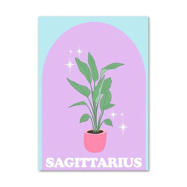
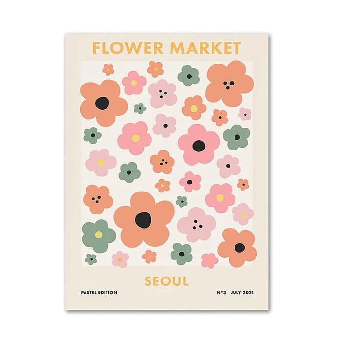
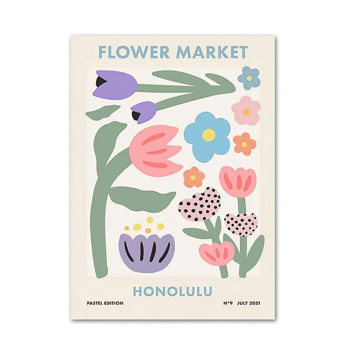
For smaller prints, the Danish Pastel Canvas Posters come in options named Capri, Seoul, Honolulu, Ibiza and Madrid, in sizes from 10*15 cm up to 60*90 cm. A soft print like this can balance black frames. The Pastel Zodiac Signs Canvas Poster is a personal option, since you can choose your sign from the twelve listed, in sizes from 13*18 cm to 60*90 cm.
Hang art with its centre roughly at eye level, and keep gaps between frames even, about the width of a hand. Even spacing makes a mix of sizes look intentional.
- One focal wall, quiet walls elsewhere
- Tapestry for big colour, prints for detail
- Even gaps between frames
- Choose sizes based on your wall space, not just looks

A gallery wall without the chaos
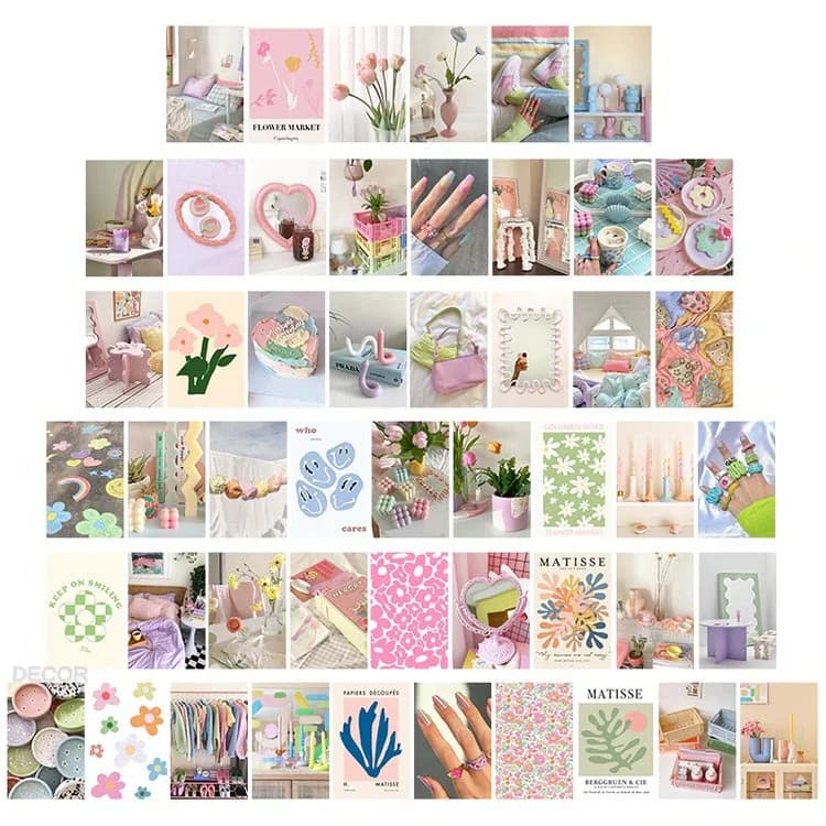
A collage wall is lovely but easy to overdo. The Danish Pastel Wall Collage Kit is listed as a 50-piece set, which is a lot of images. Treat it as a pool to pick from rather than a rule to use every piece.
Lay your chosen pieces on the floor first and arrange them into a rough rectangle. A tidy outer shape makes lots of small images read as one unit. Leave a few gaps rather than filling every inch.
Pair the collage with black through the edges: a black shelf under it, a black lamp beside it, or a dark frame next to it. That keeps the pastel images from floating and gives the eye a place to rest.
If you rent, test adhesive on a hidden spot first and follow whatever the product page says. Do not assume it is safe for every paint or wallpaper.
Black accents: where to put them
Black is the goth part, so use it deliberately. The best places are the ones with edges: frames, lamp bases, curtain rods, a bedside tray, candle holders, or a mirror frame. Hard lines in black make soft colours look crisp.
Spread black across the room in three or four small spots, in a rough triangle shape, so the eye travels around. If all the black sits in one corner, the room feels lopsided.
Avoid heavy black fabrics in a small room unless you have good light. A black rug or throw is fine, but black curtains, bedding and walls together can make a small space feel cave-like.
If you like the clothing side too, the same trick applies: a small black detail such as the Pastel Goth Cross Earrings (zinc alloy, pink option) is a fun way to echo the room’s palette on yourself. They are jewellery, not decor, but they show how the same pink and dark mix carries over.
- Black on edges and frames, not big surfaces
- Three or four spots, spread out
- Be careful in small or dim rooms

Vases and shelf styling
A ceramic or glass vase adds colour and shape without hanging anything. It also gives you a tidy way to display dried stems or just stand alone as sculpture.
The Minimalist Aesthetic Pastel Flower Vase is ceramic and comes in green, white, yellow, orange and pink, each with options 1 to 3. If you want a calm look, choose one colour that matches your palette rather than mixing several. The Danish Pastel Flower Shaped Vase is ceramic in green, lavender or beige, and lavender would suit a lilac and black scheme.
For a lighter, see-through feel, the Jardin des Fleurs Pastel Vase is glass and offers pink, mint, beige, brown and gradient options. Glass catches lamp light nicely and works well next to a black frame.
Style shelves with the odd-number rule: one tall item, one medium, one small. Leave about a third of the shelf empty. That empty space is what makes the things you chose look special.
Stop it feeling cluttered
Clutter in a pastel room usually comes from too many small things, not too much colour. Cute items multiply quickly, so set a limit: one display shelf, one desk corner, one bedside surface. Everything decorative lives there or goes in a box.
Use the one-clear-surface rule. In each zone, keep one flat surface mostly empty. A clear bedside top, a clear desk half, or a bare dresser end gives your eyes a pause.
Group like with like. Three small items in the same colour read as one object. Three small items in three colours read as mess.
Hide the practical stuff. Chargers, tissues and skincare look worse in pastel rooms because the bright packaging fights your palette. A tray or lidded box keeps them tidy.
Do a monthly reset: remove anything that no longer fits the palette, and rotate rather than add. Rotating keeps the room fresh without growing.
- Set a limit on display spots
- Keep one surface clear in each zone
- Group by colour
- Box away packaging and cables
- Rotate instead of adding
Three sample room setups
Small bedroom, tight budget: white or cream walls, a lilac duvet, one black frame with a pastel print, one lamp, one vase on the shelf. That is five changes and a clear look.
Rented room, no drilling: a tapestry on the wall behind the bed, two Kawaii Pillows in pink, a black throw, a bedside lamp from the lighting range, and a glass vase. Everything can be removed without damage, provided you check how you hang the tapestry.
Dark room already: if your walls are navy or charcoal, let pastels glow. Use light pink bedding, a mint vase, and a lamp with a soft glow. You need very little extra black, so spend on colour and light instead.
For more ideas beyond these, browse the full aesthetic room decor range and compare styles against your two chosen colours.
Comparing options before you buy
Check three things on every product page: size, material, and colour options. A listed size in centimetres tells you more than a photo, so measure your wall or shelf with a tape first.
For prints and posters, sizes are listed as pairs of centimetres and inches. Compare them to your furniture rather than guessing. A 30*40 cm print is fairly modest, while 60*90 cm makes a real statement.
For vases, note whether the material is ceramic or glass, as listed. Ceramic gives a solid, opaque presence; glass lets light through. If a product page does not state something, such as whether a vase is waterproof, ask support before assuming.
Screens vary, so pastel shades may look a bit different in person. Pick colours that are forgiving, and keep your bedding neutral so slight differences do not clash.
Final checklist
Run through this before you click buy or finish decorating. If most boxes are ticked, the room should feel calm and cohesive.
- Two pastels and one dark chosen and written down
- Base colours (walls, bedding) calm and simple
- At least two light sources besides the ceiling
- One focal wall, other walls quiet
- Black used in three or four spread-out spots
- Odd-number groups on shelves, with empty space left
- One clear surface in every zone
- Cables and packaging hidden
- Sizes measured against your actual space
- Product details checked on each page, nothing assumed