Created by the Kawaii Vibe editorial team. Our named style desks are editorial personas. Product details and availability can change.
If you want the short answer: warm undertones usually look good in pastels with a little cream, peach or butter in them, while cool undertones tend to look good in pastels with a little blue, lilac or grey. That is a starting point, not a law. Plenty of people wear the "wrong" pastel and love it, and a lot of it comes down to where the colour sits relative to your face.
This guide is about cute pink aesthetic outfits and the blues and yellows that sit alongside them. We will cover how to work out your undertone without a fancy test, which shades to try first, how to build full outfits, and how to use accessories to fix a colour that is almost right. Everything is written as flexible suggestion, because pastel dressing is supposed to be fun.
Mika here, writing for The Style Desk. I have not tried any of the items mentioned, so the advice is based on general colour logic and the product details listed in the shop. Use it as a way to narrow down options before you buy, then trust your own mirror.
Start here: a quick way to guess your undertone
Undertone is the subtle tint under your skin colour, separate from how light or deep you are. Warm leans golden, peachy or yellow. Cool leans pink, red or bluish. Neutral sits in between. You can have very fair skin with a warm undertone or deep skin with a cool one, so do not guess from depth alone.
Try three easy checks in daylight, near a window, with no makeup if you can. First, look at the veins on your inner wrist: greenish often points warm, bluish or purple often points cool, and a mix suggests neutral. Second, hold a plain white top and then a cream one under your chin. If white looks crisp and cream looks muddy, you may lean cool. If cream looks softer and white looks stark, you may lean warm. Third, notice which jewellery metal feels natural. Gold often suits warm, silver often suits cool, and neutral tends to carry both.
None of these is conclusive on its own. If your results disagree, treat yourself as neutral and enjoy the widest range. The goal is only to decide which pastels to try first, not to lock yourself out of anything.
- Check in daylight, not under yellow bulbs
- Compare white against cream near your face
- Note whether gold or silver looks more natural
- Mixed results usually mean neutral, which is a good thing
Why pastels behave differently near your face
Pastels are colours with lots of white mixed in, so they are quiet and low in contrast. That means the tiny tint inside them matters more than in bold colours. A pink with a hint of orange reads as peachy and warm. A pink with a hint of blue reads as bubblegum or rosy and cool. Side by side on a hanger they look nearly identical, but on skin the difference shows up.
What you notice is usually one of two things. Either the colour makes your skin look bright and even, or it makes you look a bit washed out or sallow. Washed out often happens when a pastel is both pale and close to your own skin shade, so there is no contrast. Sallow often happens when the pastel's tint fights your undertone, like a yellow-green mint on very cool skin.
The good news is that this only really matters for the part of the outfit near your face: neckline, collar, scarf, hat, headband. Trousers, skirts and socks sit far enough away that you can pick purely on what you like. So if you love a shade that is slightly off for your undertone, wear it low and put a friendlier colour up top.
Pinks for warm undertones
Warm skin tends to enjoy pinks that have a touch of coral, peach, salmon or apricot. Think of a soft sorbet pink, a dusty peach-rose, or a creamy strawberry-milk shade. These pick up the golden glow in the skin instead of competing with it. Very icy, blue-leaning pinks can feel a little cold on warm skin, though a lot of people still like them, especially in small doses.
A simple outfit to try: a peachy-pink tee, a cream pleated skirt or wide-leg trousers, and white or cream sneakers. Add a warm-toned accessory such as a butter-yellow headband. The cream does the heavy lifting by softening the transition between your skin and the pink. If you want more shape, tuck the tee in at the front only so the waistline shows without feeling stiff.
For browsing, the broad Pastel Clothing collection is a sensible place to compare how different pinks look in photos. Zoom in and judge the tint, not just the product name. A listing might say pink, but the image will tell you whether it leans coral or bubblegum. Remember that screens vary, so treat the picture as a guide, not a guarantee.
Pinks for cool undertones
Cool skin often looks lovely in pinks with a little blue or lilac in them: bubblegum, rose quartz, cherry-blossom, orchid-tinged pink. These sit comfortably with the pink in the skin and tend to look fresh rather than sweet-and-sticky. Peachy pinks can work too, but they sometimes look a bit orange against cool skin, particularly in strong light.
Try this combination: a rosy-pink knit or tee, light grey or pale denim bottoms, and white socks with sneakers. Grey is a handy partner for cool pastels because it calms the pink without warming it up. Add silver-toned hair clips or small silver earrings, and a lilac or baby-blue accent if you want extra softness.
If your wardrobe is already full of pinks and you are not sure which direction they lean, line them up on a bed in daylight and put the bluest ones in one pile. That pile is probably your most cool-friendly group. The Soft Girl Outfits collection is useful when you want a ready-made gentle look, since many soft girl pieces use these rosy, lighter pinks. Check each item's photo to see how the colour reads.
Blues: baby, powder and sky across undertones
Pastel blue is the easiest cool-toned pastel, but warm skin can wear it well if you pick the right one. Cool undertones usually look great in powder blue, periwinkle-leaning baby blue and icy sky blue. Warm undertones often prefer blues that are slightly softer or greener, like a faded denim blue, light aqua or a milky robin's-egg shade, because these have a gentle warmth that echoes the skin.
One easy cross-over trick is to use blue as a base with a bridge colour. A warm person can wear baby blue with cream or butter yellow, which warms the whole look. A cool person can pair the same blue with white or lilac to keep it crisp. Same top, two different personalities.
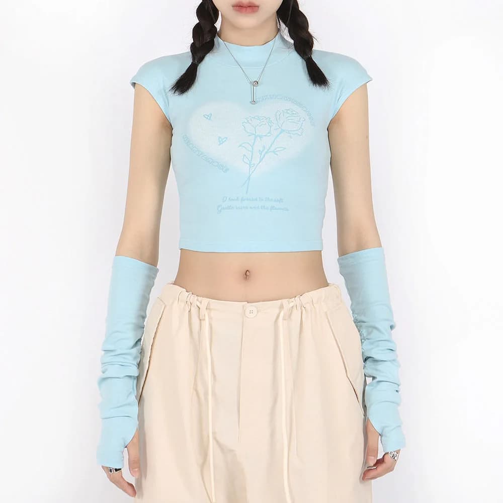
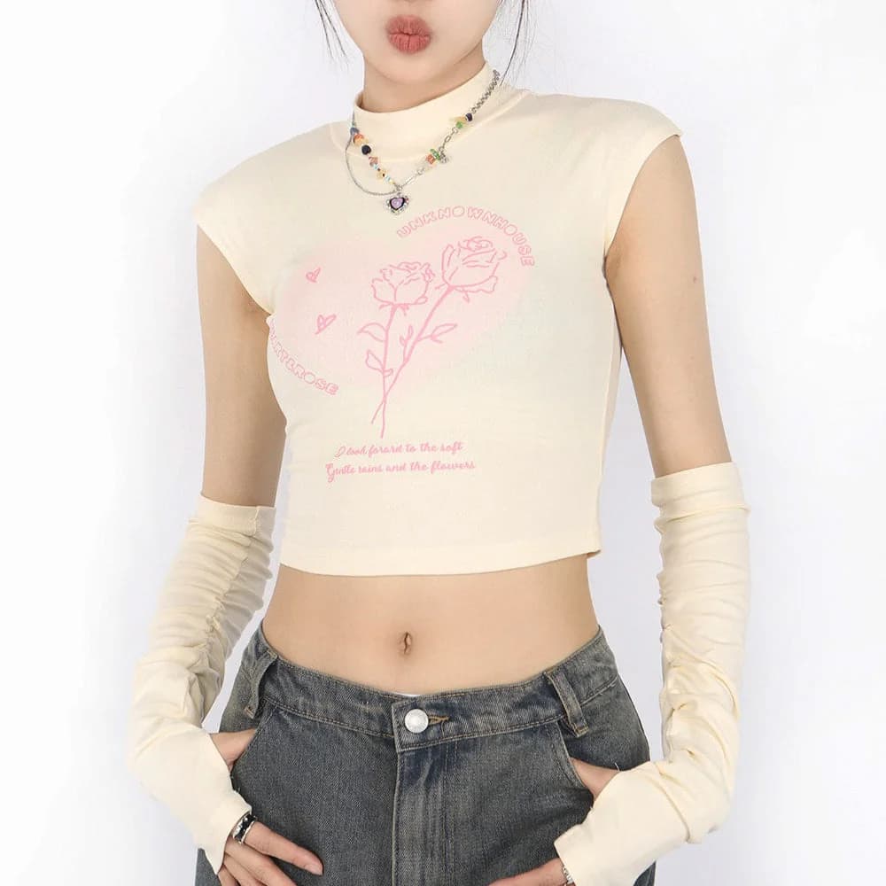
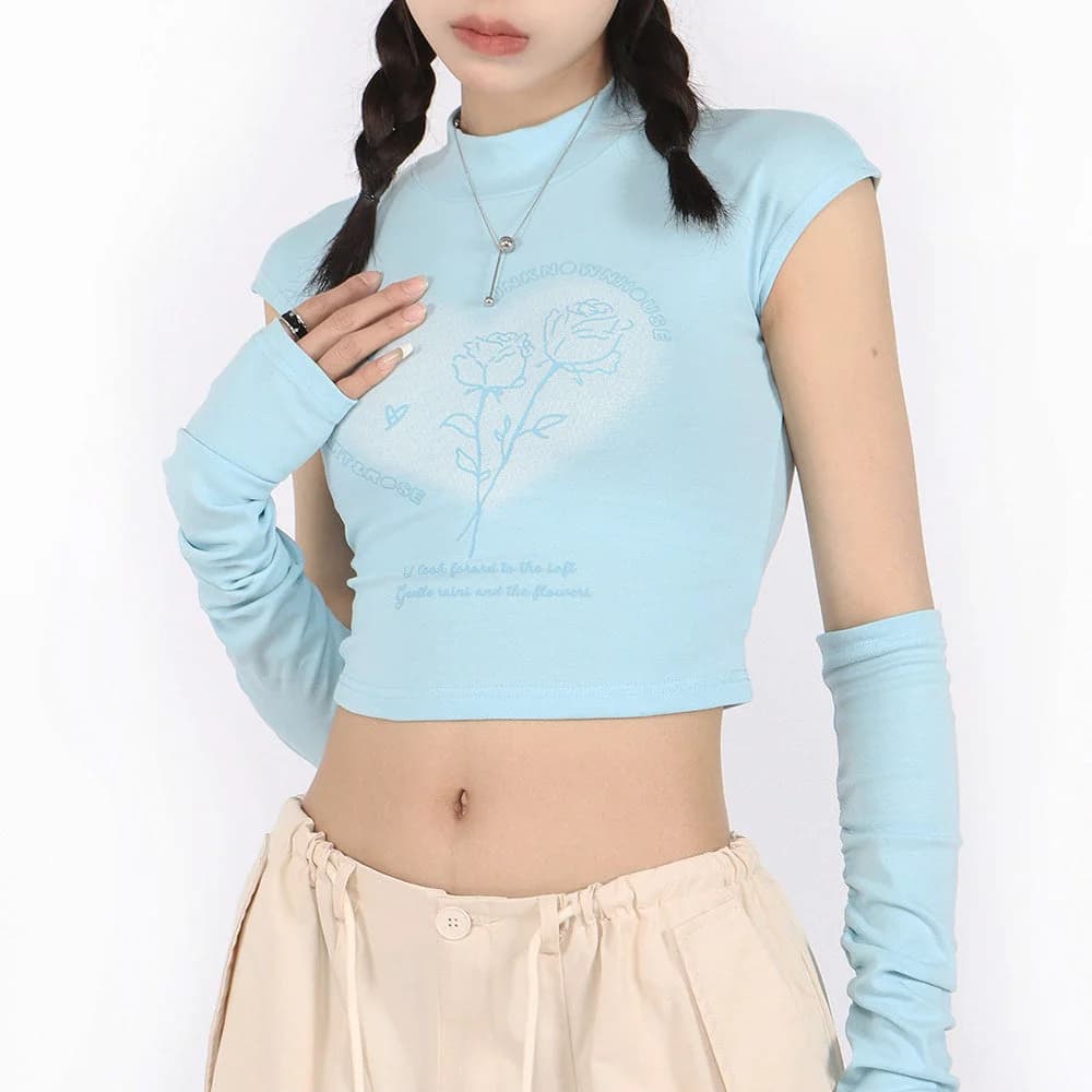
The Pastel Soft Girl Tee with Arm Warmers comes in Blue and Beige, listed in sizes S, M and L, with a cotton and polyester blend. That makes it a handy example: the blue option could suit cooler skin near the face, while the beige could be the calmer pick for warmer skin. The arm warmers are part of the styling, so think of them as a layer that adds colour near the hands rather than a full sleeve. I would check the product page for the exact fit before ordering.

Yellows: the tricky one, made easy
Pastel yellow scares people, and fair enough. Held right under the chin, it can make some skin look tired. But there are many yellows, and finding yours is mostly a matter of how warm or cool the shade is. Butter, cream and soft banana yellows tend to suit warm undertones beautifully, since they echo golden skin. Lemon-sherbet yellows with a slightly greenish, cooler cast tend to suit cool undertones better.
If you are unsure, use yellow away from your face. A yellow skirt with a white top, yellow socks, a yellow phone case or a small yellow hair accessory all give you the colour without the risk. This is also a way to test whether you like it before committing to a full yellow top.
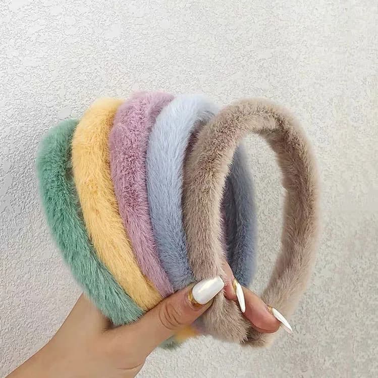
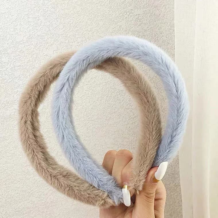
On the accessories side, the Pastel Aesthetic Fluffy Headband is listed in yellow among its eleven options, including white, grey, brown, baby blue, pink, dark pink, green, purple and orange. It is made of polyester and plastic, in a standard size. That range is helpful for undertone testing because a headband sits right at your face. You can choose a warmer yellow or a cooler baby blue depending on how you read, and the cost of a wrong guess is small.
Neutral undertones and mixing everything
If you land in the middle, you have the most freedom, though it can feel like less direction. Neutral undertones can usually wear both peachy and bluish pinks, and both creamy and lemony yellows. The deciding factor then becomes contrast and mood, not undertone.
A reliable approach is to pick one warm pastel and one cool pastel and let a neutral hold them together. For example, a soft pink top, a baby-blue cardigan over the shoulders and cream trousers. The cream is the peacemaker. Another mix is a lilac tee with butter-yellow socks and white sneakers, where the lilac and yellow sit opposite each other on the colour wheel and make each other look brighter.
When mixing, keep the "loudness" of each pastel about equal. A very milky pink next to a fairly saturated mint will look uneven. Hold items up together in daylight and see whether one jumps out. If so, swap that item for a version a shade lighter or deeper. Also, limit yourself to three pastel colours in one outfit, plus a neutral, so it reads as intentional and not like a candy shop.
Depth matters too: light, medium and deep skin
Undertone is only half of it. How light or deep your skin is changes how pastels look because contrast is the other big factor. On very fair skin, the palest pastels can disappear, so slightly more saturated shades like carnation pink or clear sky blue can add definition. On medium skin, almost the whole pastel range works, and the main question is warmth. On deeper skin, pastels often pop strongly, and slightly brighter pastels like candy pink, lilac, mint and sunny yellow tend to look vivid and fresh rather than faded.
If pastels feel too faint on you, nudge the pastel one step stronger instead of abandoning it. A pastel can be soft without being chalky. Look for words like candy, bubblegum or sherbet rather than ice or milk, and check the photos to see how much white is in the colour.
You can also create contrast through the outfit. A pale pink top with a darker bottom, like navy or chocolate brown, gives a pale colour something to stand against. Even a dark belt, bag strap or pair of shoes can make a washed-out pastel feel intentional. Contrast is a tool you control, regardless of skin shade.
Five outfit formulas you can adapt
Here are five combinations built around undertone, each with a swap to move it warmer or cooler. One: pink tee, cream skirt, white sneakers. Warm swap: peach-pink tee. Cool swap: bubblegum tee with a white skirt. Two: baby-blue shirt, light-wash jeans, white socks. Warm swap: add a butter-yellow belt or bag. Cool swap: add a lilac hair clip.
Three: a pastel overshirt open over a white tank and pale trousers. The Pastel Shirts collection is the place to look for this, since a shirt gives you collar and button placement to play with. Roll the sleeves to the forearm, leave two buttons undone, and tuck loosely. Four: a monochrome pink day, mixing two or three shades of pink from soft to slightly deeper, with white accents. Warm people can lean to coral-pink and cream; cool people to rose and silver-toned jewellery.
Five: a blue and yellow combo, like a baby-blue top with a pale yellow skirt. Warm skin will enjoy a creamy butter yellow; cool skin might prefer a lemon-leaning shade with white socks to sharpen it. In each formula, keep the piece closest to your face in the most flattering tint and let the other pieces be purely about taste.
- Pink tee + cream skirt + white sneakers
- Baby-blue shirt + light jeans + white socks
- Pastel overshirt + white tank + pale trousers
- Tonal pink layers + white accents
- Blue top + pale yellow bottom + neutral shoes
Proportions, layering and weather
Pastels look best when the shapes are easy. If you have a roomy top, try a closer-fitting or high-waisted bottom. If you have a fitted top, a looser skirt or wide-leg trouser balances it. This keeps a sweet colour palette from turning into a shapeless pile of soft fabric.
For warm weather, stick to lighter layers: a tee, a thin overshirt tied at the waist, or a sleeveless top with a pastel cardigan in your bag. The Pastel Soft Girl Tee with Arm Warmers is a good example of a piece that adds a layered look without a full jacket, though I would check the product page to see how it is designed before assuming how warm it will be. For cooler days, add a pastel knit over a collared shirt, and use socks and a hat for colour.
Weather also changes how colours read. In bright sun, pastels can look more washed out, so lean to slightly stronger shades. On grey days, they can look softer and more muted, so pastels with a bit of warmth help keep your skin looking lively. Pick a layer you can add or remove and the colour story stays the same all day.
Accessories that fix a colour that is almost right
Say you bought a pink top that is a touch too cool or warm. You do not have to return it. Place an accessory near your face that bridges the gap. If a blue-pink feels icy on warm skin, add a cream scarf, gold-toned earrings or a butter-yellow headband. If a peachy pink feels orange on cool skin, add a lilac or baby-blue accent, silver jewellery or a white collar underneath.
Hats and headbands do this job well because they sit between your face and the rest of the outfit. The Pastel Aesthetic Fluffy Bucket Hat is polyester, comes in a Pastel option and a standard size, and works as a colour accent at the top of an outfit. Because the listing shows it as a single Pastel option, check the photos to see which shades appear and whether they suit your tone.
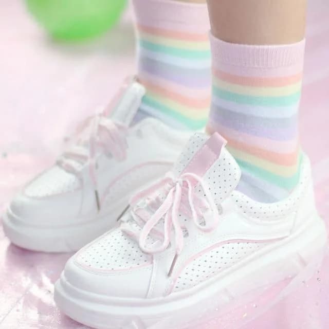
Socks are the lowest-risk accessory. The Pastel Pink Striped Socks are one size and shown as pictured, and could add a pink note near the ankles to tie in with a top. For more choice, the Naturally Sweet Pink Aesthetic Socks come in cotton and polyester, with options such as Red Flower, Cherry, Heart, Honey Color, Oh That's and a Set of 5. Honey Color might lean warmer, which is a guess from the name, so check the images.

Small touches: phone cases and room colours
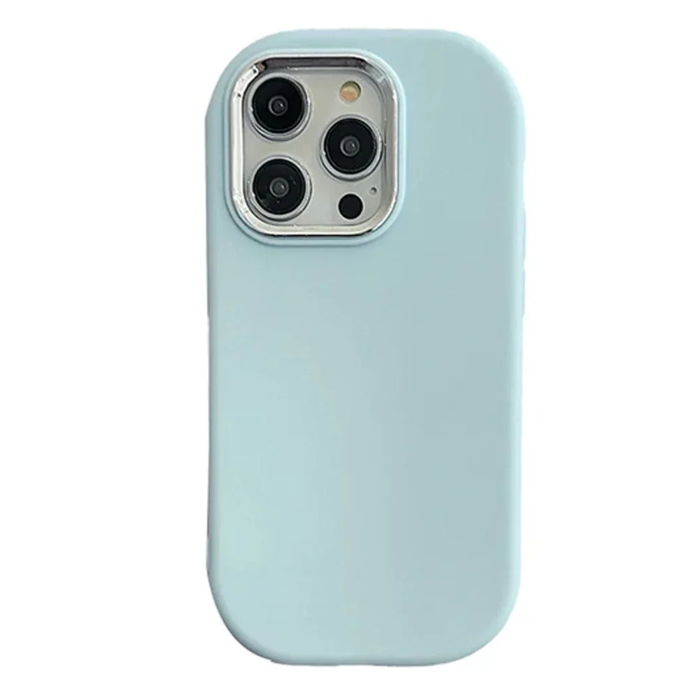
Your colour palette does not stop at clothes. A phone case is the thing you hold up near your face and see all day, so it is a fun way to test a shade. The Danish Pastel Aesthetic iPhone Case is listed in Blue, Light Pink, Yellow, Pink, Purple and White, for a range of iPhone 12 to iPhone 15 models. Pick the colour that echoes your outfit: Light Pink for a cool rosy look, Yellow for a butter-and-cream day. Check that your exact model is on the list before ordering.
If you prefer something more decorative, the Bear Rhinestones iPhone Case is listed as Multi, with sizes from iPhone 13 up to iPhone 17 Pro Max. Because the colour is multi, it works best with a plain outfit, like a white tee and pale denim, so the case becomes the accent.
If you like your pastel palette to carry into your room, the Pastel Pink Carrot Bed set is shown as pictured, in several sizes from 150x200cm (3pcs) up to 220x240cm (4pcs). It is not clothing, but it is a handy way to keep your pink theme consistent. Match the size to your mattress before choosing, and check the listing for what each piece count includes.
How to compare pastel options before you buy
Online, pastel shades are tricky because screens and lighting change them. Start by reading the colour name and the photos together. A product called pink could be coral, bubblegum or dusty rose, and the photo tells you more than the label. Look at pictures with natural light, and if there are model photos, look at the skin tone of the person wearing it to see how the colour behaves.
Next, check the material and fit details on the listing. Cotton blends often look softer and slightly more matte, while polyester can look a bit brighter or shinier, though this varies. If material information is missing, do not assume. Check the size options, too, so you are not guessing about fit. For a wider look at inspiration, the Aesthetic Clothing collection shows how pastels sit alongside other styles, which helps you see what you can mix in.
Finally, compare by role. Ask what job the piece does: a face-framing top, a quiet base, or a playful accent. Face-framing items deserve the most undertone care. Bases need to be neutral and versatile. Accents can be whatever makes you smile. This keeps you from over-buying near-identical pastel tops.
Common pitfalls and a final checklist
The most common mistake is treating undertone as a rule. If you love a colour, wear it, and use a bridge colour or accessory to make it work. The second is buying pastels that are all the same lightness, which can make an outfit look flat. Mix one slightly deeper tone or a neutral to give it shape. The third is ignoring lighting: check colours in daylight, not just in a bedroom mirror under a warm lamp.
Another pitfall is going all in on one colour head to toe without a break. A pink top, pink skirt and pink shoes can work, but only if you vary the shades. Add white, cream or grey to separate the pieces. Finally, avoid buying a full outfit for a single event without testing the colours together at home first.
Before you check out, run through this quick list. If you can answer yes to most of it, you are probably in good shape.
- Do I have a rough idea of my undertone, or am I treating myself as neutral?
- Is the piece nearest my face in a tint I like in daylight?
- Do I have a bridge colour such as cream, white or grey to connect pieces?
- Are there no more than three pastels in the outfit, plus a neutral?
- Have I checked the listing for size, material and colour options?
- Do I have one accent that adds contrast or personality?