Created by the Kawaii Vibe editorial team. Our named style desks are editorial personas. Product details and availability can change.
Wearing vibrant multicolor jewelry does not mean your outfit has to feel crowded or chaotic. When a single pendant or ring carries red, orange, yellow, green, blue, and purple, it already commands significant visual attention. The primary challenge is arranging those saturated hues against your clothing collars, neckline shapes, and other accessories so that each piece looks intentional rather than haphazard.
Whether you prefer delicate pastel prisms, bold resin beads, or faceted crystals, balance comes down to three physical factors: the architecture of your neckline, the undertone of your metal base, and spacing between layered chains. By treating multicolor elements as deliberate focal points instead of background noise, you can build looks that range from understated everyday accents to full-spectrum statement outfits.
In this guide, we break down the practical mechanics of pairing multicolor pieces with diverse collar cuts, choosing between gold, silver, or black bases, and harmonizing jewelry with both neutral staples and busy graphic garments.
1. The Core Rule: Anchor Hues Before Adding Chains
When styling multicolor jewelry, the fastest route to a cluttered look is adding pieces without an anchoring center. Because rainbow palettes naturally bounce the viewer's eye across the entire color wheel, your outfit needs a stable base. This means deciding whether your jewelry will contrast against a quiet, solid garment or harmonize with a pattern that already features multiple shades.
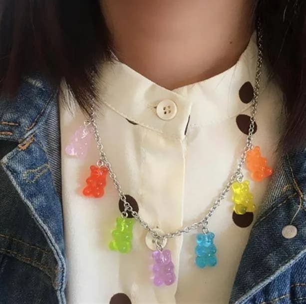
If your outfit features a single dominant neutral like ivory, charcoal, or denim, your multicolor jewelry becomes the primary color driver. In that setup, you can layer two or three slender pieces together because the clothing provides calm negative spaceAn uncluttered area that gives the rest of a design room to stand out.. Conversely, when your clothing is loud or graphic, introducing stacked multicolor chains creates competing focal points. In those situations, a single cleanly placed piece will always look sharper than three overlapping strands.
To build a reliable setup, start by picking one lead item—such as a vibrant collar chain from our rainbow necklaces collection—and evaluate whether the surrounding fabric gives it room to breathe. Once that anchor sits comfortably against your chest or collarbone, you can decide if secondary accents are actually needed or if they just create visual static.
- Choose one multicolor piece to serve as the dominant visual focal point before picking extras.
- Use solid clothing fabrics to provide resting space for multicolor gems or beads.
- Step back and check if secondary chains obscure the main pendant or blur into fabric prints.

2. Scoop and Wide Round Necks: Framing Suspended Prisms
Scoop necklines expose a wide curved swath of skin along the clavicle, making them one of the easiest shapes to decorate with vibrant jewelry. Because the scoop provides a clear expanse of skin unobstructed by collars or lapels, a short to mid-length pendant sits flat without catching on hems. A necklace that mirrors the gentle downward curve of the scoop creates an orderly, frame-like appearance that keeps the vibrant stones centered.
For a casual warm-weather look, consider pairing a delicate multicolor stone pendant with a fitted scoop cut like the Rainbow Striped Tank Top, which features a scoop neckline and slim fit in polyester. Because this top already incorporates distinct horizontal bands of color, keep your necklace chain fine and short enough to rest purely on bare skin rather than dropping over the striped fabric edge. This spatial gap prevents the jewelry from visually tangling with the stripes.
If your scoop neck is cut especially wide, you can flank your primary pendant with a plain, unembellished choker sitting an inch higher. Keeping that secondary upper strand completely monochrome—plain silver or gold without gems—grounds the look while letting the multicolor pendant underneath stand out crisply.
- Position pendants so they rest directly on bare skin above the fabric rim of the scoop.
- Keep chain curves proportional to the dip of the scoop collar to maintain balanced framing.
- Add a single plain metal choker above the multicolor piece only if the open chest area feels empty.

3. Crew Necks and Graphic Tees: High-Contrast Overlays
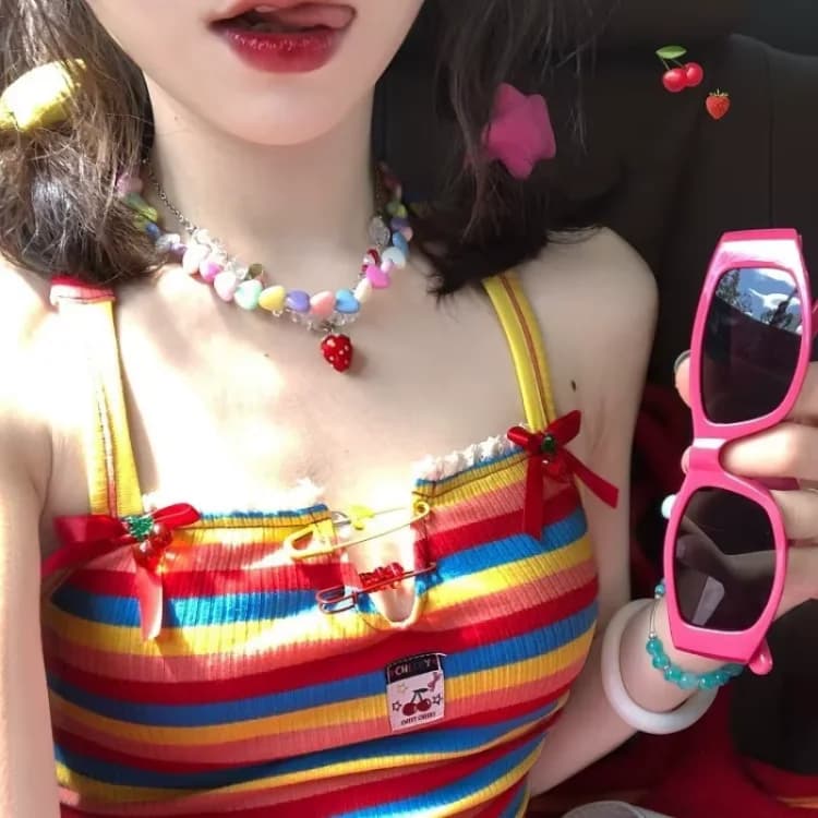
A classic crew neck leaves virtually no open skin at the collarbone, meaning any necklace you wear must sit entirely on top of the fabric. This fundamentally alters how multicolor jewelry behaves. Instead of contrasting with your natural skin tone, the gems or enamel now compete directly with the texture, weave, and color of the shirt fabric. Placing fine, multi-stone chains directly over detailed graphics often results in visual mush where neither the print nor the chain can be distinguished.
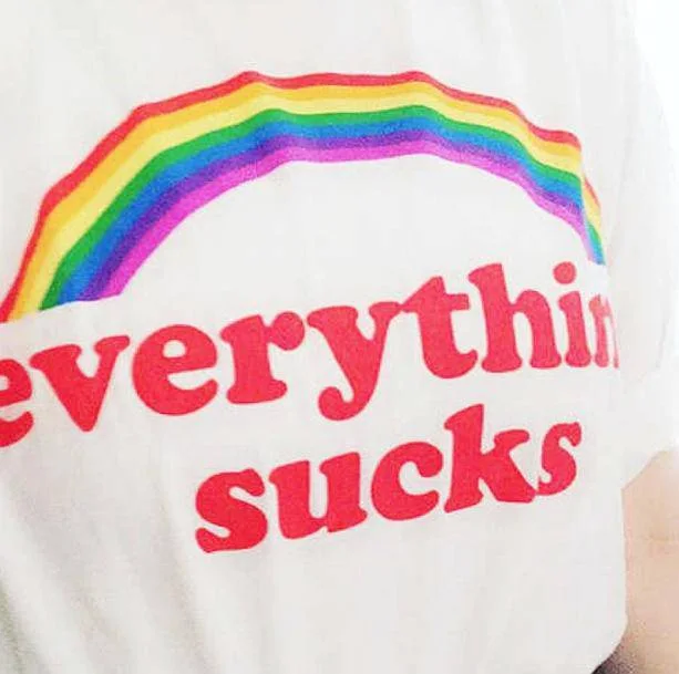
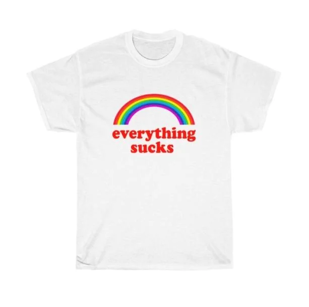
When dressing in a graphic piece like the Everything Sucks Rainbow T-Shirt, which has a regular casual fit and a front graphic print, jewelry placement requires strict boundaries. A short choker will rest snugly above the graphic boundary, resting clean against the ribbed collar band where it will not overlap the print lettering. Alternatively, choose a longer chain that drops several inches past the artwork toward the ribcage.
Weight also matters when layeringWearing pieces over or under one another to add depth, warmth or contrast. over cotton or jersey blends. Lightweight chains can twist or get lost in the fold of a casual tee. Slightly heavier links or beaded styles sit flat against the chest, holding their geometry against the moving fabric throughout the day without flipping upside down.
- Situate short necklaces directly along the ribbed crew collar to avoid touching print graphics.
- Select medium-weight links rather than whisper-thin threads so chains stay flat against jersey.
- Skip delicate multicolor pendants over complex graphic artwork in favor of bolder statement beads.
4. High Necks and Turtlenecks: Long Pendants and Bold Cuffs
High-neck tops create a tall, uninterrupted pillar of fabric from your chest to your jawline. While this completely rules out skin-contact jewelry, it offers a dramatic canvas for extended pendants that would otherwise feel too heavy against an open chest. The trick is to treat the high neck like an artist’s backdrop, using gravity and chain length to break up the vertical stretch of fabric.
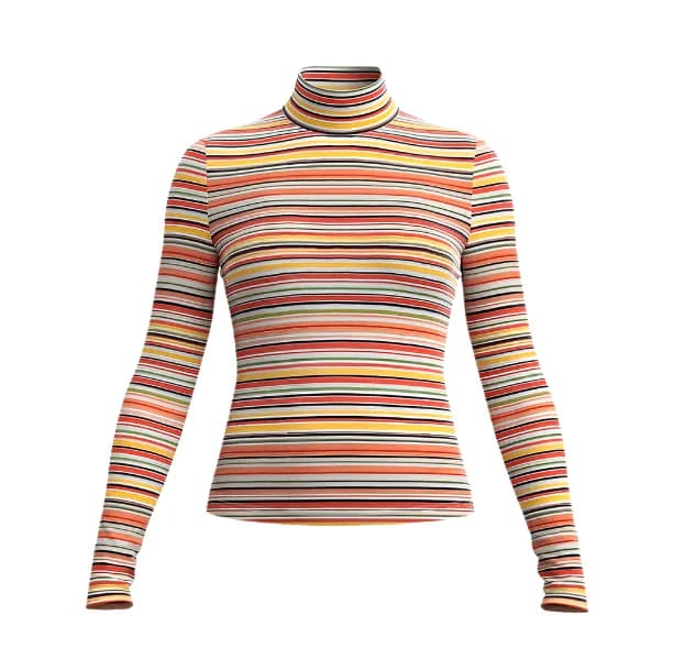
A fitted piece like the Rainbow Muse High Neck Top, made of polyester, pairs exceptionally well with long opera-length chains or lariat cords carrying rainbow stations. Because the high collar draws the eye upward, a long necklace creates an intentional downward V-shape that elongates your torso. Make sure the chain has enough physical weight so it does not bunch or pull on the smooth fabric.
When a high neckline feels fully occupied, shift the color focus down to the wrists using pieces from our rainbow bracelets collection. Stacking structured cuffs or tennis bracelets over a long, fitted sleeve creates a tailored retro finish. This leaves your throat area streamlined while still displaying your love for multicolor accents.
- Use 24- to 30-inch chains to cut a vertical line down high-neck solid tops.
- Ensure chain links have enough physical heft to drape cleanly over smooth knit fabrics.
- Move multicolor accents to wrists and rings if a high collar already features a complex pattern.
5. Collared Shirts and Zip Fronts: The Notch Technique
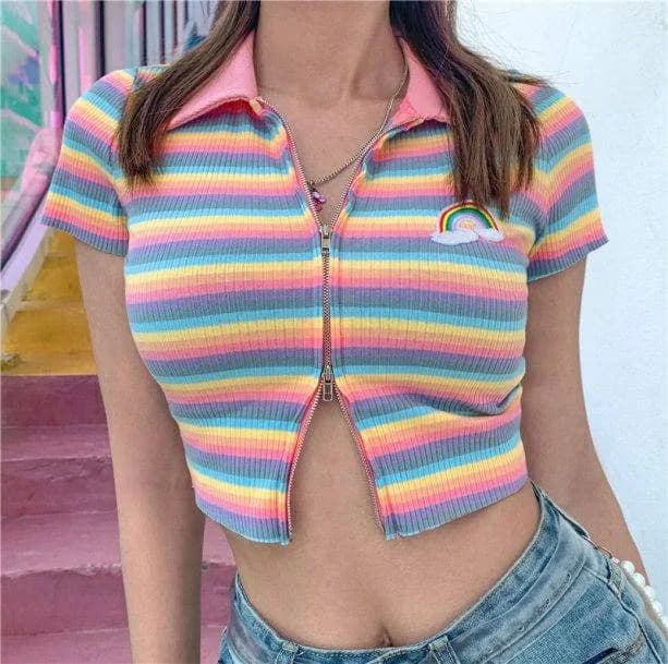
Collared button-downs, polo shirts, and sporty zip pullovers introduce sharp lines and hardware into your upper body styling. The triangular opening formed by an unbuttoned shirt or a partially pulled-down zipper creates a distinct notch that demands precise necklace measurement. If your pendant falls exactly on top of the zipper teeth or under the collar leaf, it will snag, flip, and look cluttered.
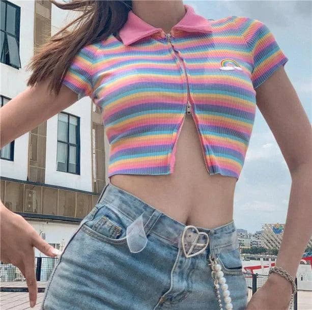
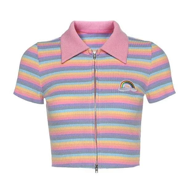
Consider an athletic silhouetteThe overall shape an outfit creates, from fitted to loose and layered. like the Rainbow Zipper Up Top. The functional zipper creates an adjustable V-neckline framed by athletic seams. To style jewelry here, adjust your chain length so the central gem rests either directly in the hollow of your throat above the metal pull, or unfasten the zipper lower so the necklace floats unobstructed inside the open triangle of skin.
Never let a multicolor pendant collide with metallic zipper teeth. If the zip pull is shiny chrome or brass, a pendant dangling right next to it looks like accidental tangling. Give the jewelry at least two inches of clear clearance above or below the fastener to ensure each element retains its individual identity.
- Measure chain drop to ensure pendants sit cleanly within the open V of an unzipped collar.
- Prevent fine chains from rubbing against zipper teeth to avoid scratching and tangled links.
- Use rigid collars to frame smaller, geometric multicolor gems with crisp symmetry.
6. Chunky Knits: Scaling Proportions to Heavy Yarns
Winter layers and oversized knitwear bring heavy physical volume and deep yarn textures to an outfit. Fine jewelry that looks delicate and airy against summer linen often disappears entirely into cable knits, looped wool, or fleece. Worse, delicate prong settings can snag on knit loops, pulling threads loose from your favorite clothing while bending the jewelry clasps.
When styling an oversized piece such as the Rainbow Stripes Sweater, made of cotton, your jewelry must possess adequate scale to balance the substantial knit texture. Instead of a hairline chain, opt for chunky chain links, bezel-set stones where metal fully wraps the gem rims, or smooth enamel charms that cannot pull yarn fibers. A wider necklace anchors the thick ribbed collar of the sweater without being swallowed by the weave.
Similarly, with graphic cold-weather tops like the Rainbow Bear Sweater, featuring a polyester, cotton, and acrylic knit blend, consider skipping neck chains altogether. Instead, rely on larger drop earrings, rings, or sturdy bangle bracelets. This maintains the vibrant theme while keeping the sweater's textured knit front smooth and completely snag-free.
- Choose bezel-set stones rather than delicate prongs to eliminate yarn snags on knitwear.
- Select heavier gauges of chain to match the visual scale and weight of thick cotton knits.
- Pivot to statement rings and ear cuffs when cozy sweaters feature dense, multi-tone patterns.
7. Gold Settings: Warmth, Saturated Primaries, and Earthy Tones
The metal base holding your multicolor stones sets the emotional temperature and visual harmony of the entire piece. Yellow gold and warm rose tones bring out the red, orange, and golden-yellow components of a rainbow spectrum. Gold acts as a rich, unifying thread that ties contrasting stones together, softening the jump between cool blues and fiery magentas.
Yellow gold settings work exceptionally well against warm base fabrics—such as cream, mustard, olive, camel, and warm chocolate browns. When paired with saturated primary colors, gold lends a vintage 1970s feel that appears collected and mature. If your jewelry features warm-toned stones like citrine, carnelian, and peridot alongside cool blues, the yellow gold frame pulls the overall visual weight toward the warm side of the spectrum.
To keep gold rainbow jewelry looking intentional, carry the warm metal choice throughout your secondary hardware. Matching your bag buckles, belt clasps, and auxiliary earrings to yellow gold ensures that the multicolor pieces feel like a deliberate styling decision rather than a random grab from the jewelry box.
- Pair gold-mounted rainbow gems with cream, camel, and earthy clothing foundations.
- Rely on warm metal casings to soften abrupt color transitions between jewel tones.
- Match auxiliary hardware like belt buckles and zippers to your jewelry's gold base.
8. Silver and White Metals: Cool Tones, Pastels, and High Saturation
Silver, white gold, and stainless steel offer a sharp, icy clarity that handles bright colors very differently than yellow gold. Rather than warming the palette, white metals act like a crisp white gallery wall. Every stone—whether it is mint green, sky blue, lilac, or cherry red—stands out with high-definition separation, making the individual colors appear cooler, punchier, and more graphic.
White metal bases look striking against cool-toned garments, including heather gray, crisp optic white, stark black, and classic blue denim. If you prefer pastel rainbow schemes—such as soft lavender, butter yellow, and baby blue—silver settings provide the icy neutral support needed to keep those pale tints from looking muddy. It also leans comfortably into Y2K, retro-futuristic, and streetwear styles that favor industrial metal finishes.
When layeringWearing pieces over or under one another to add depth, warmth or contrast. with silver, you have more freedom to include plain chain-link textures like paperclip, curb, or box chains. Because silver carries less inherent warmth, multiple silver chains sitting alongside a multicolor necklace will read as clean structure rather than heavy ornamentation.
- Select silver bases to make pastel and cool-toned stones appear crisp and distinct.
- Coordinate white metal rainbow pieces with optic white, charcoal, and classic blue denim.
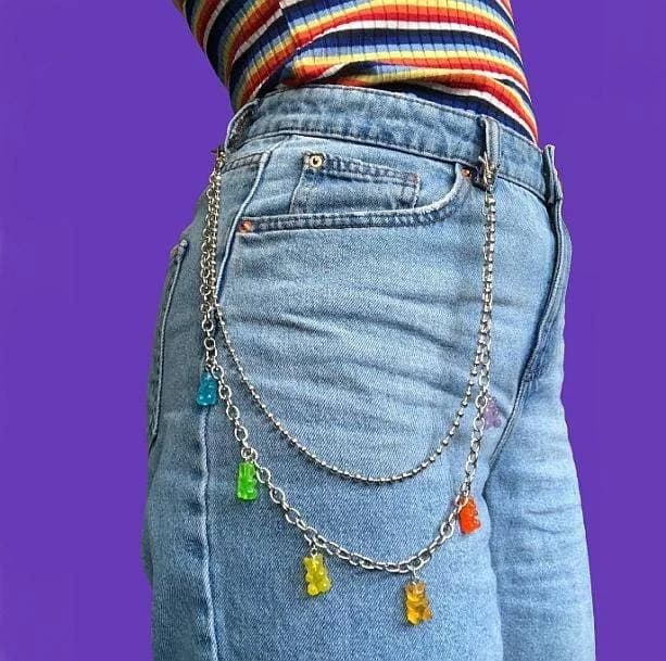
- Layer unadorned curb or paperclip silver chains alongside stones for a balanced street-ready finish.
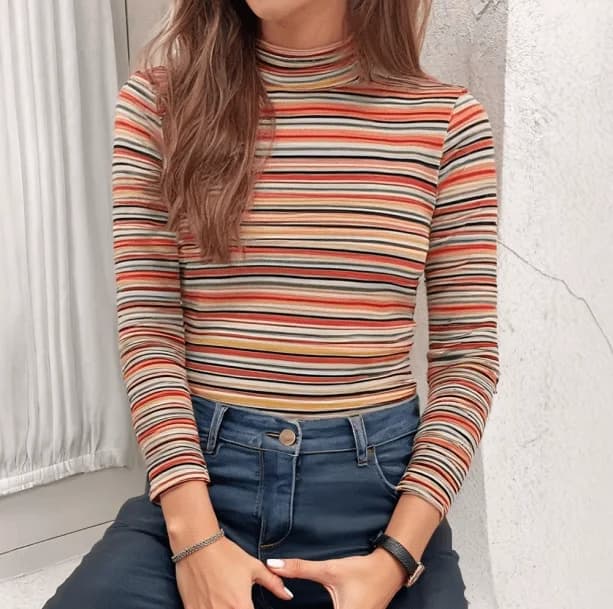
9. The Mixed-Metal Dilemma: Rules for Combining Base Colors
Many people wonder whether they can wear both silver and gold alongside multicolor stones. The answer is yes, but only if the combination looks planned. Because a rainbow item already introduces multiple hues, mixing uncoordinated metals at random can make an ensemble feel disjointed. The secret lies in using intentional bridge pieces that tie the metals together.
A bridge piece is any item that inherently includes both metals—such as a ring featuring intertwined silver and gold bands, or a necklace clasp finished in dual tones. Once a bridge piece is present on your body, the viewer recognizes that the metal clash is a deliberate choice. From there, you can easily flank a gold rainbow pendant with a slender silver chain, provided the metal weights are reasonably matched.
Another reliable method is spatial grouping. Keep all your throat jewelry strictly in yellow gold, while allowing your wrist stacks to feature silver chains mixed with vibrant bands from our broad rainbow jewelry selection. Dividing the metals by physical body zones prevents competing tones from fighting for attention in the exact same focal area.
- Include a dual-toned bridge piece to make mixed silver and gold combinations feel intentional.
- Separate contrasting metal tones across different body zones, such as neck versus wrists.
- Maintain similar chain thicknesses when pairing two distinct metal finishes on the chest.
10. Calculating Drop Lengths: The 2-Inch Spacing Rule
LayeringWearing pieces over or under one another to add depth, warmth or contrast. necklaces without creating a tangled clump requires mathematical discipline regarding chain lengths. The most common mistake is pairing two chains of similar drop length—such as a 16-inch chain and a 17-inch chain. Movement throughout the day will inevitably cause the lower pendant to bang against the upper charm, tangling the links and obscuring the stones.
To maintain clean visual separation, follow the 2-inch spacing rule. If your shortest multicolor choker sits at 14 inches tight to the neck, your next chain should measure at least 16 inches, and a third chain should drop to 18 or 20 inches. This vertical air gap allows each necklace to hang in its own distinct arc. The negative spaceAn uncluttered area that gives the rest of a design room to stand out. between chains is what keeps a layered stack looking sophisticated instead of messy.
Furthermore, vary the physical density of the strands. If your 16-inch anchor piece is a dense band of multicolored stones, make sure the 18-inch chain below it is an airy, open-link cable chain with minimal hardware. Alternating dense visual weight with open negative spaceAn uncluttered area that gives the rest of a design room to stand out. prevents the entire cluster from reading as a solid block of clutter.
- Enforce a minimum two-inch difference between stacked necklace lengths to prevent overlapping.
- Alternate heavy, stone-packed strands with open, lightweight link chains.
- Check movement in a mirror: jump gently to see if pendants swing into each other or remain separated.
11. Managing Bead Size, Stone Cut, and Texture Density
Not all rainbow jewelry carries the same visual footprint. A strand of 12mm opaque acrylic pony beads projects an entirely different weight and presence than a 2mm micro-faceted sapphire tennis necklace. Understanding texture density prevents your jewelry from looking like a disorganized collection of random souvenirs.
When combining multiple textured pieces, pair opposites deliberately. A smooth, reflective enamel pendant pairs smoothly with a flat, polished snake chain. Conversely, highly faceted crystals that throw geometric light reflections look best alongside untextured matte metals that do not compete for sparkle. If you are wearing chunky, tactile beads, avoid pairing them with delicate seed beads; the dramatic scale difference causes the smaller piece to look accidental.
Texture management extends to your clothing pairings as well. Wearing smooth stone jewelry alongside textured prints—like the woven pattern on our Midi Plaid Rainbow Skirt, constructed from durable polyester—creates an appealing tactile balance. Because the skirt supplies detailed textile patterning on the lower half, keeping your upper jewelry sleek, polished, and geometric keeps the entire silhouetteThe overall shape an outfit creates, from fitted to loose and layered. well-proportioned.
- Balance faceted, sparkling gems with flat, non-reflective chains to control overall shine.
- Pair similar scale grades together: avoid micro-beads right next to oversized heavy acrylics.
- Contrast smooth jewelry finishes against textured woven garments to create tactile depth.
12. Coordinating Jewelry with Multicolor and Patterned Garments
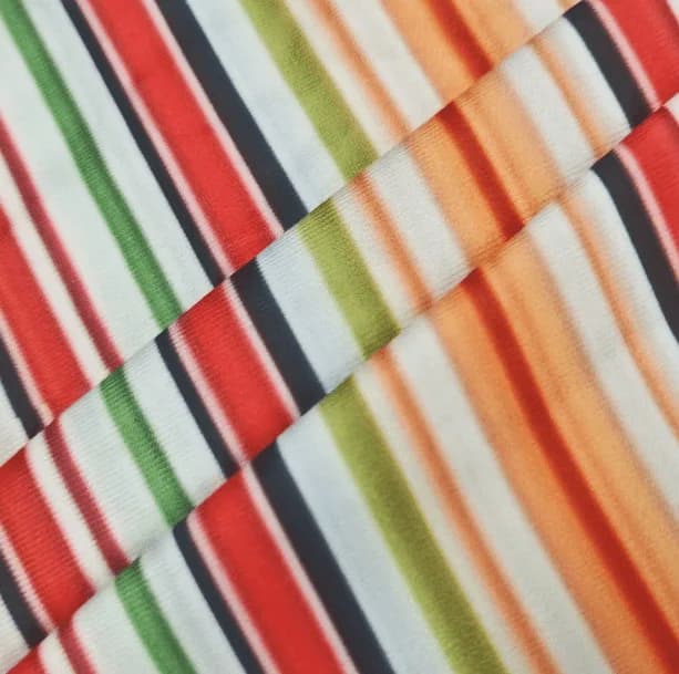
One of the most intimidating styling challenges is wearing multicolor accessories alongside garments that already feature multicolor prints. The instinctive fear is looking over-saturated, but you can achieve an effortless pairing by employing the concept of color isolation. Color isolation means picking one specific tint from your printed garment and echoing it through your jewelry choices.
Take a look at an expressive garment like the Psychedelic Rainbow Top, crafted with a cotton and spandex blend. With its swirling aesthetic patterns, adding a full-spectrum rainbow necklace directly on the chest might overwhelm the look. Instead, style that top by wearing pieces from our rainbow accessories line placed further away—such as hairpins, earrings, or rings—or choose a piece of jewelry that spotlights only one or two accent colors found in the swirl.
Alternatively, explore comprehensive styling ideas across our rainbow aesthetic clothes collection to identify solid layeringWearing pieces over or under one another to add depth, warmth or contrast. staples like cardigans, dungarees, or overshirts. LayeringWearing pieces over or under one another to add depth, warmth or contrast. a solid, unprinted garment over a patterned top creates clean borders, providing a dedicated solid shelf where a multicolor pendant can rest without visual interference.
With a swirling multicolor top, choose one jewelry accent and place it away from the chest, such as small earrings instead of a layered necklace. For a bolder print-and-accessory mix, Ganguro Clothes offers a distinct styling direction; skin tone does not need to change to make that outfit choice.
When a patterned top and necklace already draw attention to the chest, place any extra color away from the neckline. A bright hair clip inspired by oshare-kei clothes adds a playful accent without crowding the necklace or garment pattern. Choose one shade from the top for the clip, and keep other accessories restrained so each detail remains distinct.
- Echo one specific accent tone from a patterned top rather than matching every single color.
- Shift multicolor jewelry to ears, wrists, or hair when your main shirt features bold swirl prints.
- Use unprinted overshirts or cardigans to create calm borders between prints and jewelry.
13. Common Styling Pitfalls and How to Correct Them
The quickest way an outfit derails when styling vibrant jewelry is the 'costume trap.' This happens when rainbow themes are applied simultaneously to earrings, necklaces, bracelets, rings, belts, socks, and shoes. When every single item screams in full-spectrum primary colors, the individual craftsmanship and beauty of your jewelry gets lost in the noise. To avoid this, select two body zones maximum for multicolor pieces—for instance, a necklace and a ring, or earrings and a bracelet stack.
Another frequent pitfall is ignoring chain gauge relative to neck scale. Ultra-chunky collar chokers can make shorter necks appear truncated, especially when layered over high-collared shirts. If you have a shorter neck or prefer a more open posture, gravitate toward mid-length drops (18 to 22 inches) with slender chains that draw the eye downward in an elongating line. Reserve thick chokers for open scoops, off-the-shoulder cuts, or square necklines.
Lastly, watch out for clasp clustering. When layeringWearing pieces over or under one another to add depth, warmth or contrast. three separate necklaces, their rear clasps often tangle into a knot behind your neck, pulling the chains unevenly in the front. Use a multi-strand necklace spacer clasp, or select chains with slightly differing clasp styles (like a toggle paired with lobster claws) to prevent the back of your hair from becoming a bird’s nest of tangled metal.
- Limit multicolor accessories to a maximum of two body zones per outfit to preserve impact.
- Select chain drop lengths that elongate the neck rather than cutting it horizontally.
- Use necklace layeringWearing pieces over or under one another to add depth, warmth or contrast. spacers at the back of the neck to prevent clasps from tangling together.
14. The Clutter-Free Rainbow Jewelry Checklist
Before heading out the door wearing your multicolor jewelry, run through a quick tactile and visual audit. Check whether your outfit feels balanced, physically comfortable, and visually cohesive. Spending sixty seconds assessing how your pieces interact with your clothes will save you from spending the day adjusting twisted chains, untangling knots, or feeling self-conscious about clashing patterns.
First, evaluate physical movement. Lean forward slightly and stand back up: do your pendants hang smoothly, or did they snag on your collar, catch on knit yarns, or flip backward? Second, examine color dominance. Look in a full-length mirror from six feet away. Does the eye naturally settle on one or two clear focal points, or does the outfit feel visually noisy? If your chest area looks busy, removing just one chain will almost always instantly restore clarity.
Finally, ensure your metals and outfit hardware speak the same language. If your jewelry setting is gleaming silver, make sure your bag straps, jacket snaps, and shoe buckles do not clash aggressively without a bridge piece in place. With these basic parameters mastered, you can confidently wear full-spectrum jewelry that looks artful, deliberate, and entirely clutter-free.
- Test necklace movement to confirm chains do not tangle, catch, or flip over during activity.
- Verify that layered chains maintain a clean two-inch vertical spacing down your chest.
- Check that metal settings harmonize with bag hardware, zippers, and belt buckles across the entire outfit.