
Created by the Kawaii Vibe editorial team. Our named style desks are editorial personas. Product details and availability can change.
Kawaii drawing looks simple, and that is the trap. A round face with two dots for eyes can feel warm and charming, or it can feel flat and accidental. The difference usually comes from a few small decisions: where the face sits on the shape, how much empty space surrounds it, how soft the colors are, and whether the shadow is gentle or heavy.
This guide gives you six original projects to build in Procreate. Each one is a small, finishable subject: a smiling cloud, a frog on a lily pad, a strawberry carton with no brand on it, a sleepy moon, a cat mug and a mushroom house. For every project you get the composition, the order to draw the shapes in, a palette and a plan for shadows. The steps are written as numbered bullets so you can follow along without losing your place.
Nothing here needs advanced skill. If you can draw a circle, a bean shape and a wobbly line, you can make all six. The one habit we push throughout is keeping line work and color on separate layers. It makes every later change, such as a new color, a thicker outline or a moved face, a quick fix instead of a redraw.
Pick one project and finish it fully before starting the next. A finished simple drawing teaches you more than three abandoned ambitious ones.
Practical setup before you draw anything
Start with a square canvas. Squares suit kawaii work because the subject sits in the middle with equal breathing room on every side, and they crop neatly for stickers, notebook covers, phone backgrounds and posts. Work large enough that you can zoom out and still see clean edges, then shrink the final image later.
Next, build a layer habit. For each drawing, make at least these layers, from bottom to top: a plain background color, a flat color layer for each major part, a shadow layer, a highlight layer, and a line layer on top. Keeping the outline separate means you can recolor it later. Soft brown lines often look friendlier than pure black, and swapping them is easy when they live on their own layer.
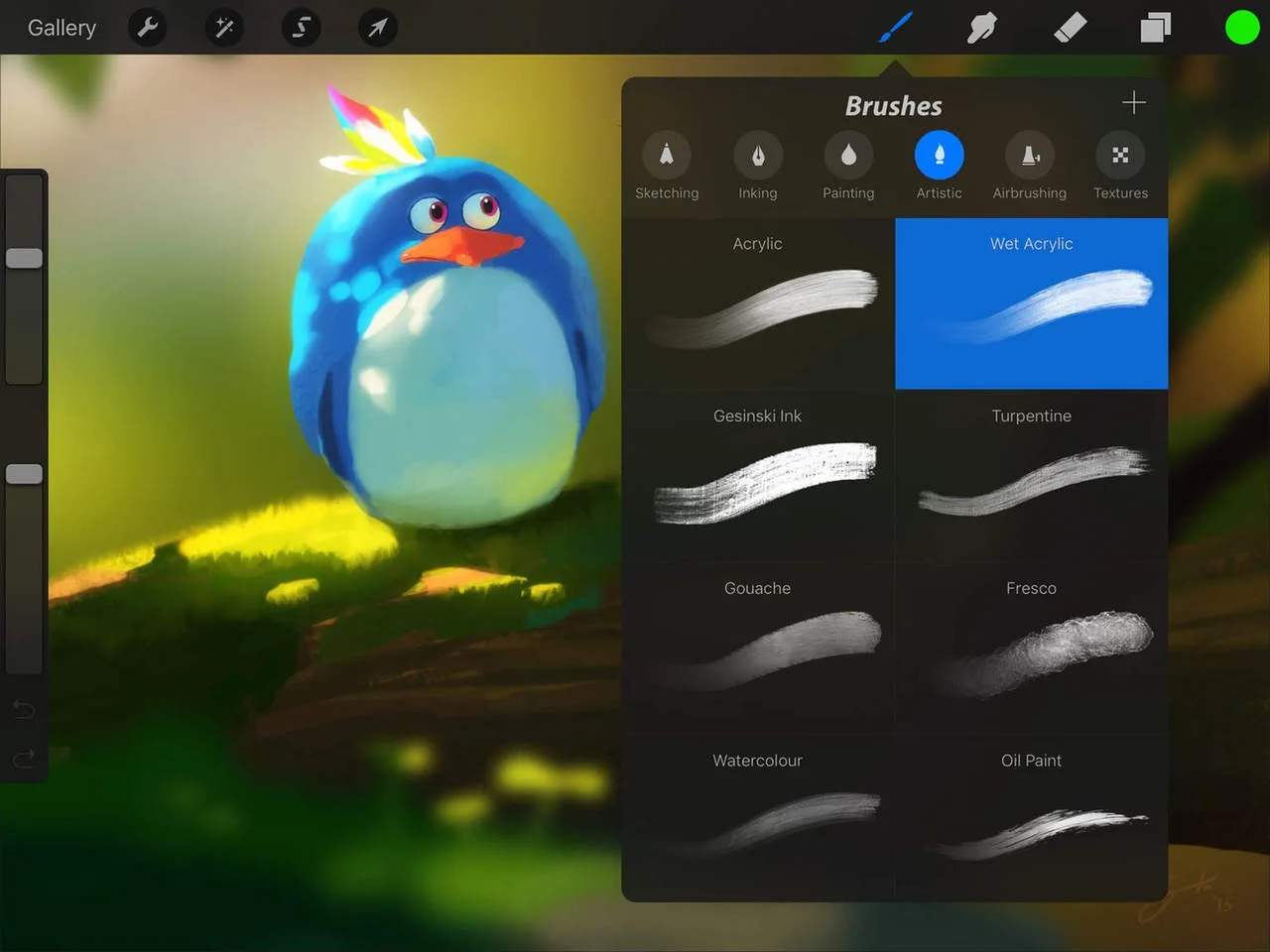
Procreate supports layers, and the layer options menu includes clipping masks. A clipping mask lets paint on one layer show only where the layer beneath it has color. That is ideal for shadows and blush, because you can scribble loosely without going outside the shape. For the exact steps on your version, see the Procreate Handbook page on layer options. We use the idea of clipped shadow layers in every project below, but we leave the button hunting to the official guide.
Choose a brush for lines and a brush for color. A smooth, even-width pen is best for outlines. Use anything with a clean edge for filling. Avoid textured brushes at first. Texture is lovely later, but it hides shape mistakes you should be seeing now.
Set up a small palette before you begin. Kawaii colors tend to be light, a little milky and low in contrast, with one or two deeper accents to keep things from looking washed out. A good rule: pick a main color, a lighter version of it, a slightly darker and warmer version for shadow, and one accent. Four colors per object is plenty.
Finally, decide on your face rules. Place the eyes low on the shape, wide apart, and keep them small. Put the mouth between and slightly below them, tiny. Add blush under the outer edge of each eye. Low, wide-set features read as young and soft. Use the same face rules across all six projects and your set will look like a family.
- Canvas: square, large, with a calm background color on its own layer.
- Layer order: background, flat colors, shadow, highlight, lines on top.
- Palette: main color, light tint, warm shadow tone, one accent.
- Face: eyes low and wide, tiny mouth between, blush just below the eyes.
- Shadows: always on a separate layer, clipped to the shape they belong to.

Project 1: The smiling cloud
A cloud is the best warm-up because it is almost all curves and has no wrong silhouetteThe overall shape an outfit creates, from fitted to loose and layered.. The aim is a puffy, slightly lopsided body with a face that sits low in the middle, so the top bumps feel like a fluffy crown.
Composition: place the cloud slightly below the center of the canvas and leave generous space above it. That empty space makes the cloud feel like it is floating. Tilt the whole shape a few degrees so it does not look stiff. Add two or three tiny sparkles or raindrops around it at different distances, but keep them smaller than the eyes so they never compete with the face.
Palette: avoid pure white. Use a pale blue-white for the body, a soft lavender-gray for shadow, a light peach pink for blush, and a butter yellow for sparkles. Set it against a mid-tone sky color, such as a dusty periwinkle, so the cloud stands out without a heavy outline.
Shadow: keep it on the underside only. Because clouds are round, the shadow should be a curved band along the bottom, following the bumps rather than cutting across them. Add a small lighter highlight on the upper left bump to suggest a soft light source.
- 1. Draw a wide, flat-bottomed base shape, like a rounded loaf, on the first layer.
- 2. Add three overlapping circles on top: a big middle one, a medium one on the left and a smaller one on the right.
- 3. Fill the combined silhouetteThe overall shape an outfit creates, from fitted to loose and layered. with the pale blue-white on a color layer.
- 4. On a clipped shadow layer, paint a curved band along the bottom in lavender-gray.
- 5. Add a small highlight on the upper left bump with a lighter tint.
- 6. On the line layer, draw eyes low and wide, a tiny smile and two oval blush marks.
- 7. Scatter the sparkles last, then check the shape at thumbnail size.

Project 2: Frog on a lily pad
This drawing is about stacking simple shapes: a flat oval pad, a squat bean body and two bulging eye domes. The charm comes from the frog being nearly as wide as it is tall, which gives it a sleepy, squishy feel.
Composition: put the lily pad as a wide ellipse in the lower half of the canvas and sit the frog slightly off-center on it. Leave a wedge cut out of the pad, a small notch, which makes it read as a lily pad instead of a plate. Add a tiny ripple ring under the pad, since a few curved lines of water do a lot of work.
Palette: choose a fresh apple green for the frog, a deeper teal-green for the pad so the two do not blend, a cream belly, and a coral pink for cheeks. For the water, use a pale aqua. Keep the frog lighter than the pad, because the lightest value should belong to the main character.
Shadow: the strongest shadow is the one the frog casts on the pad, a flattened oval right under its body. Then add a soft shade under the chin and inside the lower edge of the belly. Clip these to their shapes so the green never leaks outside the body.
- 1. Draw the lily pad as a wide oval and cut a small triangular notch out of one side.
- 2. Sketch the frog body as a wide bean, wider at the bottom, sitting on the pad.
- 3. Add two eye domes on top of the head, overlapping the body outline.
- 4. Fill the pad, the frog and the belly patch on separate color layers.
- 5. Paint the frog's cast shadow on the pad in a darker teal, using a clipped layer.
- 6. Add shade under the chin and a bright highlight on each eye dome.
- 7. Draw the face on the line layer: dot pupils, a wide thin smile and two round blush spots.
- 8. Finish with a few curved ripple lines around the pad.

Project 3: Strawberry carton with no brand
This one is a still life: a small paper-style berry basket overflowing with cartoon strawberries. It must have no logos or text, so the design relies on pattern and color. That is a good lesson in itself, since the checked or woven texture of the carton does the work a label would normally do.
Composition: draw the carton as a shallow trapezoid, wider at the top, and place it in the lower center. Stack three to five strawberries above the rim so they overlap it slightly, with one strawberry tilted to break the symmetry. Only give faces to two of the berries. A whole crowd of faces gets busy, and two is enough to carry the personality.
Palette: use a warm strawberry red, a deeper raspberry for shadow, mint green for leaves, a cream yellow for seeds, and a soft kraft beige for the carton. Add a pale pink background to keep things light, and use the beige carton as the calm area that frames the red.
Shadow: berries are round, so shade them on the side opposite your highlight and under the leaf cap. The carton gets a shadow just under the rim, where the berries hang over it. Add a short glossy highlight to each berry and leave it as a clean pale shape rather than a smudge.
- 1. Draw the carton as a trapezoid with a slightly curved top edge.
- 2. Add vertical slats or a simple grid of small rectangles, evenly spaced, as the carton pattern.
- 3. Draw the berries as rounded triangles with soft corners, overlapping the rim.
- 4. Fill carton and berries on separate color layers, with leaves on their own layer.
- 5. Paint raspberry-colored shade on the right side of each berry using a clipped layer.
- 6. Dot the seeds in cream yellow as tiny teardrops, in loose diagonal rows.
- 7. Add the shadow under the carton rim, then the highlights.
- 8. Put faces on two berries only, then finish the lines.
Project 4: The sleepy moon
A crescent moon with closed eyes is a classic for a reason. It teaches you how to put a face on a shape that is not round. The face should sit on the inner, thicker part of the crescent, not on the thin tips, where it would look cramped.
Composition: tilt the crescent so it leans like it is resting, and give it a small nightcap or a tiny cloud blanket only if you want a story. Surround it with three or four stars of different sizes, kept to one side so the other side stays quiet. Uneven balance makes the page feel like a real night sky rather than a pattern.
Palette: use a deep indigo or midnight plum background, which lets pale colors glow. The moon works best in a creamy butter yellow, with a darker golden-peach for shadow. Stars can be a lighter yellow and a soft pink. Keep the palette to cool darks and warm lights, since that contrast is the whole mood.
Shadow: shade the inner curve of the crescent, where it would curve away from the viewer, and add two or three faint crater circles in the darker gold. Instead of a drop shadow, add a glow: a soft, large, low-opacity circle behind the moon on its own layer, in a lighter indigo.
- 1. Fill the background with indigo on its own layer.
- 2. Draw a big circle, then a second offset circle overlapping it, and use the gap to define the crescent.
- 3. Clean the crescent so the tips are soft and rounded, not sharp.
- 4. Fill with butter yellow on a color layer.
- 5. On a clipped layer, shade the inner edge with golden-peach and add the faint craters.
- 6. Draw closed eyes as small downward arcs, with a tiny mouth and blush on the thick part of the crescent.
- 7. Add the glow layer behind the moon.
- 8. Place stars, varying their sizes, and give one or two small sparkle crosses.
Project 5: Cat mug
The cat mug is a cup that happens to be a cat. Because the object is the character, you decide how much cat to show. The simplest approach is a cylinder with two small ears on the rim and a tail curving into a handle on the side.
Composition: show the mug from a slightly above, three-quarter view, so you can see an oval opening at the top. Put a thin ring of drink inside, and let a little steam curl above it. Add a saucer or small cookie beside the mug only if the page feels empty. The face sits on the front, lower than you would expect, with the whiskers as three short lines on each side.
Palette: choose a warm cream or soft gray cat body, a toffee brown for the drink, pink inner ears, and a muted blue-gray for the saucer. For a cozy mood, set it on a pale butter background. Keep the mug's color simple, then add a pattern such as a few paw prints or stripes to the body on a separate layer.
Shadow: the strongest shading runs down the right side of the cylinder, following its curve. Add a darker ring under the rim on the inside of the mug and a cast shadow on the table that stretches away from the light. The drink gets a small, bright highlight so it looks wet.
- 1. Draw an oval for the mug's opening and a curved-bottom cylinder below it.
- 2. Add two rounded triangle ears at the back edge of the rim.
- 3. Draw the handle as a curved tail on the right side, ending in a rounded tip.
- 4. Fill the body, ears, inner ears and drink on separate color layers.
- 5. Shade the right side and the inner rim with a clipped shadow layer.
- 6. Draw the face low on the front: small eyes, a tiny nose-and-mouth shape, whiskers.
- 7. Add stripes or paw prints on a pattern layer clipped to the body.
- 8. Finish with a table shadow, steam curls and a highlight on the drink.

Project 6: Mushroom house
The mushroom house is the most detailed project, so it rewards planning. Think of it as three blocks: a big cap, a stem body and a ground patch. The cap should be wider than the stem by a lot. That exaggerated top is what makes it feel like a cozy little home instead of a plain mushroom.
Composition: center the house and raise the cap slightly above the middle of the canvas. Put a round door low on the stem, a small window on one side and a tiny set of steps or a stone path leading out. Add grass tufts and one or two small mushrooms at the base, kept much smaller than the main one. Do not give the house a face unless you want a character; a door and window already give it plenty of charm.
Palette: use a strawberry or tomato red for the cap with cream spots, a warm off-white for the stem, a wood brown for the door, and a pale yellow for the window light. Mossy green for the ground and a soft sky blue or peach for the background complete the scene.
Shadow: the underside of the cap casts the most important shadow, a curved band across the top of the stem. Shade the stem on one side, and give the door a slightly darker frame. Keep the window glow bright, and add a tiny warm circle of light on the ground in front of it.
- 1. Draw the cap as a wide dome with a slightly wavy lower edge.
- 2. Add the stem as a short, rounded trapezoid, narrower than the cap.
- 3. Place a round-topped door and a small circular window on the stem.
- 4. Fill cap, stem, door, window and ground on separate color layers.
- 5. Add cream spots to the cap on a clipped layer, varying their sizes and letting a few be cut off by the edge.
- 6. Paint the cap's shadow band across the top of the stem, then shade one side of the stem.
- 7. Add steps, grass tufts and the small mushrooms on a new layer.
- 8. Do the lines last, thinner on details such as the door handle and window frame.

Finishing, polishing and keeping your set consistent
Finishing is where a drawing stops looking like a sketch and starts looking designed. Begin by zooming out until the image is the size of a thumbnail. If you can still tell what the object is and where the face is, the shape is working. If not, simplify: remove small details, enlarge the eyes slightly or darken the outline.
Next, check whether the main subject stands apart from its background when you view the image at a small size. Look for a clear difference between the light and dark areas. A kawaii drawing usually benefits from one clear focal point, often the face. If the sparkles, spots or patterns pull your eye away from it, try making those details smaller or less prominent.
Then audit your line layer. Hide it and look at the color alone. Good flat color with clean edges can stand on its own. Show the lines again and ask whether every line is needed. Often you can remove half the interior lines and the drawing becomes cuter, because the simple shapes get room to breathe.
Add finishing touches on top, sparingly. A few tiny highlights in the eyes, a bit of pink on the cheeks and one or two sparkles are enough. Resist adding a texture over everything. If you want a paper feel, put a subtle grain on a single layer at low strength, and make sure you can switch it off.
If you like turning your art into real objects, a printed set of these six drawings makes a tidy page layout, and our stationery collection is a natural place to look for notebooks and paper to pair them with. That is optional. The drawings are worth making for their own sake.
To keep the whole set consistent, reuse your face rules, your outline color and your background style. Save your four-color paletteA small group of colors you repeat to make an outfit feel connected.s with names, so you can pull them up when you start the next piece. Finally, export a copy with a plain background and another with transparency if your tools allow it, so the same drawing can become a wallpaper or a sticker later.
- Shrink the image to a thumbnail and confirm the silhouetteThe overall shape an outfit creates, from fitted to loose and layered. reads clearly.
- Check that the face is the strongest focal point.
- Hide the line layer to judge your color shapes, then remove unnecessary lines.
- Limit sparkles, highlights and textures so they support, not compete.
- Keep face rules, outline color and palette notes the same across the set.
